
Part I · Fundamentals · Chapter 4
The user interface
Graphica has a small interface for the amount it does. There is one toolbar, one row of tabs, and two kinds of tab: the data and the charts. Everything else appears inside those.
The toolbar
Along the top, from left to right:
| Control | What it does |
|---|---|
| Projects | The grid icon. Saves the project and returns to the workspace, where you load data, upload a project or open another one. |
| Undo / Redo | Step backwards and forwards through your edits. The history holds the last 30 steps. |
| Replace data file | Reads a new data file into the current project, keeping the charts. |
| Pivot data | Reshapes a wide dataset into a long one. Shown only on the data tab. |
| Export | Exports the current chart as SVG or PNG, or its data as CSV. |
| Download project | Downloads the whole project — data and charts — as a .gph file. |
| Project name | The name of the project. Click it to change it; a pencil appears beside it when you point at it. |
The toolbar adapts to the tab you are on. Pivot data only appears on the data tab, and Export offers what makes sense where you are: the dataset as CSV from the data tab, the chart as SVG or PNG — or the data behind it as CSV — from a chart tab.

Tabs
The first tab is always the data. Every tab after it is a chart, and there is no limit on how many you keep — several charts over one dataset is the normal way to work, not an edge case. Double-click a chart tab to rename it, right-click it for Duplicate, Rename and Delete, and drag tabs to change their order.
Two buttons start a new chart: the + after the last tab (labelled New chart while the project has none) adds an empty chart, and the wand at the far right of the row opens the chart wizard. Both are covered in How to create a chart.
The data tab
The data tab shows your dataset as a table. Each column header carries its name, a type button and a compute button — the subjects of Data types. Cells are editable, and every header carries a small preview of the column underneath its name — a sparkline of the distribution for numbers, dates and categories, and a count of recognized regions for country and province columns. It is there so you can see the shape of a variable before you decide to plot it.
If your file was a network, the data tab holds two tables, the nodes and the links. Two tabs at its foot, each with its row count, switch between them. See Graph visualization.
A chart tab
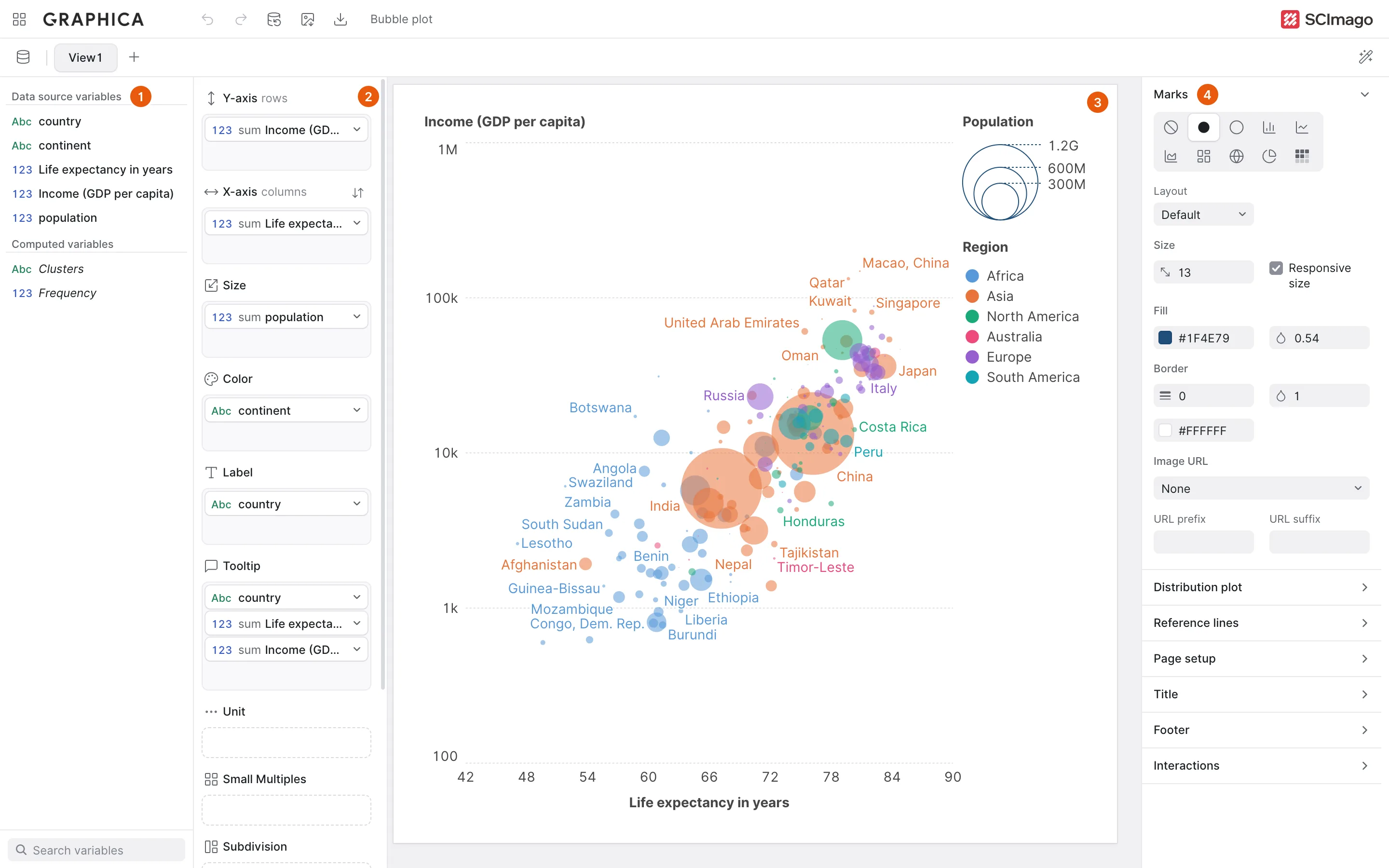
A chart tab is laid out in four columns, left to right:
- The variable list — every column in your dataset, grouped into Data source variables and Computed variables, ordered by type within each group, with a Search variables box at the foot of the list.
- The visual properties — twelve slots you drag variables onto. This is where the chart is actually defined; see An introduction to encoding.
- The canvas, where the chart is drawn.
- The chart settings — the options that apply to the chart as a whole, in collapsible sections: Marks, Distribution plot, Reference lines, Page setup, Title, Footer and Interactions.
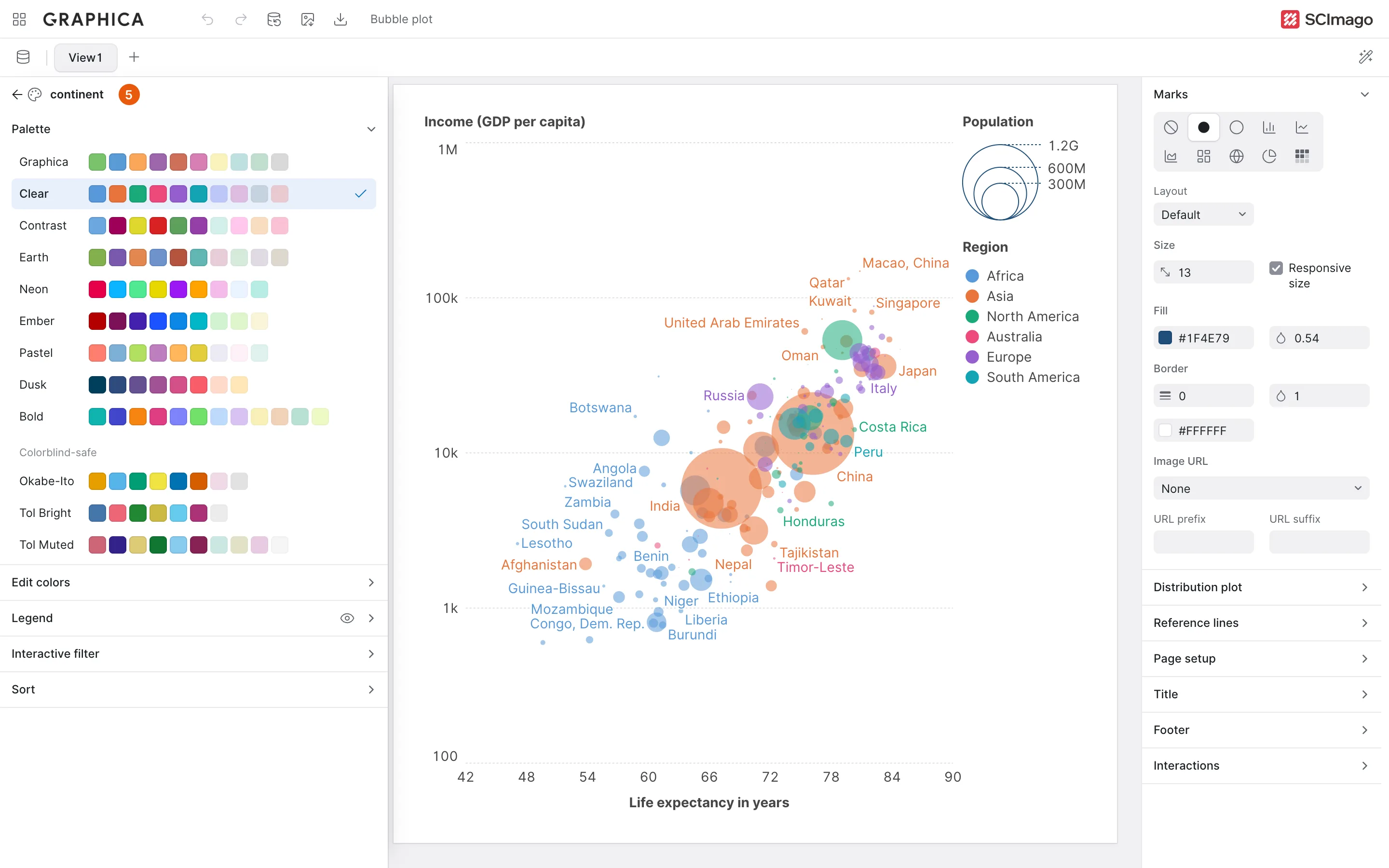
Settings that belong to one variable on one property live elsewhere. Click a variable inside a property and its settings take the place of the first two columns — for a variable on Color, the palette, the legend, the interactive filter and the sort order. The arrow at the top of that panel takes you back to the variables and properties.
The palettes are listed by name, with the one in use ticked. Colors the chart does not reach are dimmed, so you can see at a glance how much of a palette your categories use, and a palette with fewer colors than categories says that it repeats. The last three, under Colorblind-safe — Okabe-Ito, Tol Bright and Tol Muted — stay distinguishable for readers with the common forms of color blindness.
Two kinds of field recur throughout the settings. A number field with an icon — size, opacity, border width and the like — can be typed into, stepped with the arrow keys or the mouse wheel, or dragged: press on its icon and move left or right, and the value changes by one step per pixel, ten with Shift held. A color field opens Graphica's own color picker from its swatch, with a hex field, an eyedropper where the browser offers one, and the default palette as shortcuts.
A chart tab
After clicking a variable in a property
The canvas
The canvas shows the chart at its real proportions, not stretched to fill the window. If you set an explicit width and height under Page setup in the chart settings, that is what you see and what you export; if you leave them unset, the chart takes the space available.
Depending on which interaction settings you have enabled, the canvas is also live: marks can highlight under the cursor, tooltips can appear, legends can filter and the chart can zoom. That is Adding interaction.
The workspace
The grid icon at the far left of the toolbar takes you to the workspace — the list of projects stored in your browser, each as a card with a preview and the time it was last edited. It is also the screen you land on when you open the app, and where you load a data file or upload a project to start something new.
Because projects are saved continuously and live in the browser rather than in files, the workspace is worth understanding early: it is the next chapter.