
Part I · Fundamentals · Chapter 10
An introduction to filters
A filter decides which rows reach the chart. It is the quickest way to turn a crowded, general picture into a specific one, and — because filtered marks can be dimmed rather than removed — it is also a way of showing something in its context rather than on its own.
Adding a filter
Filters is the last of the twelve properties, and it works like the others: drag a variable onto it. Unlike most, it accepts any type and takes as many variables as you want. Several filters apply together — a row has to satisfy all of them to be drawn.
What the filter offers depends on the type of variable:
| Variable type | What you get |
|---|---|
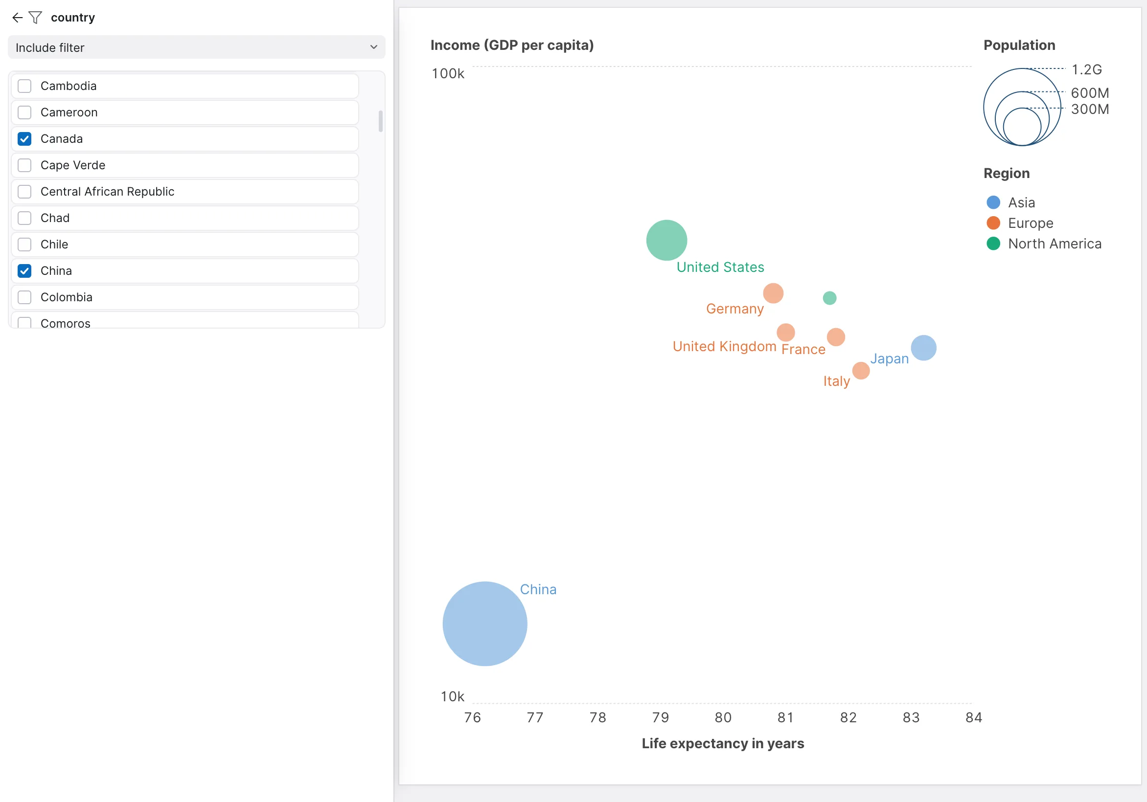
| String, Country, State / Province | A list of values to include or exclude. |
| Number | A range: a Min value and a Max value. |
| Date / Time | A range between a Start date and an End date. |
Include or exclude
Categorical filters run in one of two directions, set by the dropdown at the top of the filter's settings:
- Include filter — only the values you pick are drawn. Use it when you know what you want: three regions out of forty.
- Exclude filter — everything is drawn except the values you pick. Use it when you know what you do not want: dropping an "Unknown" bucket, or one outlier that flattens the scale.
The distinction matters more than it looks when the data changes, because each type remembers the opposite of what you tick. An include filter remembers the values you left unticked, so when next month's file arrives with two new regions, they are drawn. An exclude filter remembers the values you left unticked too — which, in that mode, are the ones you kept — so new regions stay out until you untick them. Pick the one whose behaviour on new data is the behaviour you want.
Nulls
Number and date filters can also drop rows where the variable is empty, with Filter nulls. This is worth reaching for when a variable is partly populated: rather than an axis with a large unlabelled band of blanks, you get a chart of the rows that actually have the value — as long as you are clear that is what you are showing.
Dimming instead of removing
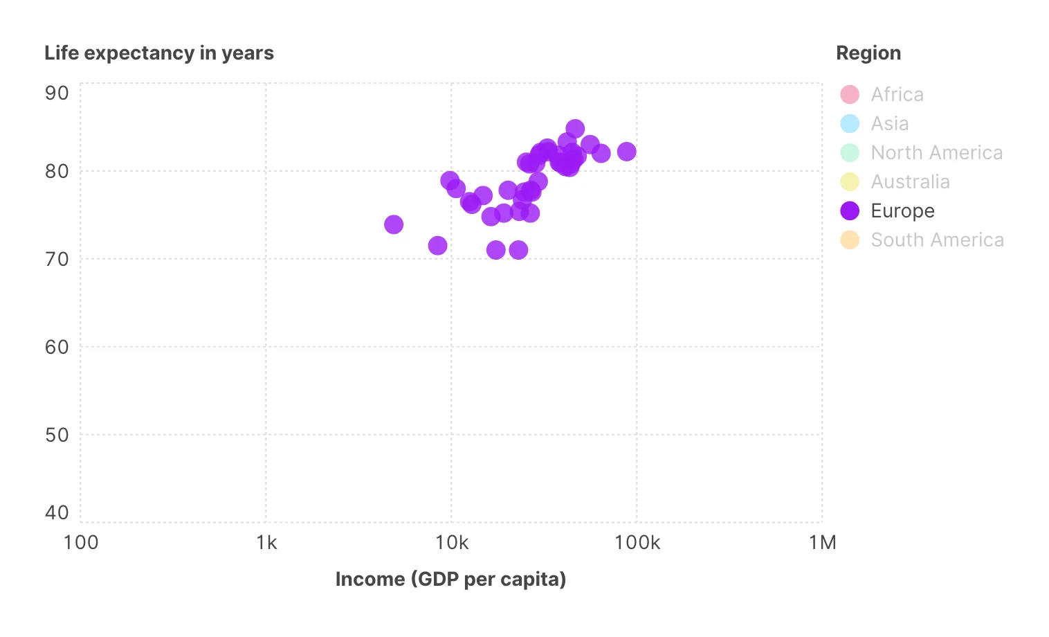
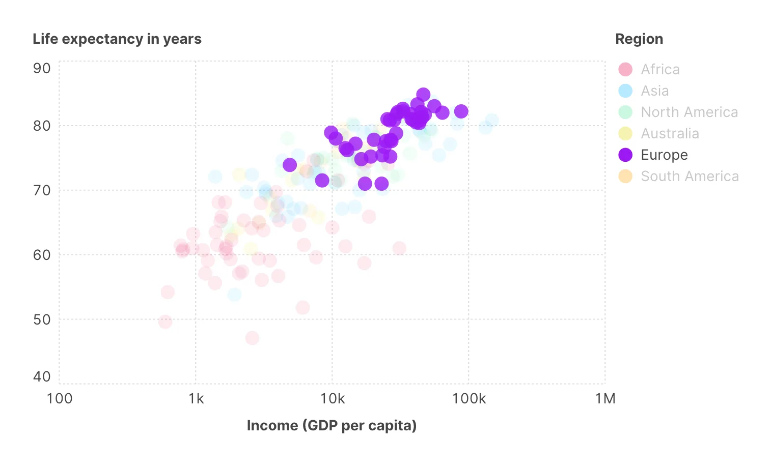
A row removed by Filters is gone: it is not drawn and it is not counted. Filtering does not have to mean removing, though. When the reader filters the chart interactively — by clicking an entry in a legend or on an axis, as described below — the marks that fall outside are not deleted but dimmed, and Filter opacity controls how much: 0 hides them completely, 1 leaves them fully visible, and anything in between leaves them as a faint backdrop. The setting sits in the Interactive filter section of the variable's settings and applies to the whole chart.
A low value — around 0.1, the default — is one of the most useful settings in the app. It lets the reader highlight a subset while keeping the whole distribution visible behind it, so they can see both which marks they picked and where those sit among the rest. Compared with simply removing the other rows, it answers "compared to what?" without a second chart. If you want that effect in a chart you build, rather than one your reader clicks, put the subset on Color instead of on Filters.
Filter opacity 0
Filter opacity 0.1
Filters your readers can operate
Everything so far is a filter you set while building. A chart can also carry filters the reader operates — which is what turns an exported visualization into something explorable.
The control is the Interactive filter setting on a legend or an axis. Set to Simple, clicking an entry in the legend selects that category and dims the rest, at the Filter opacity described above; clicking another entry moves the selection to it. Set to Multiple, each click adds an entry to the selection, so the reader can compare a handful of categories against the rest. Set to None, the legend is a static key. On a numeric axis the choice is None or Range, which adds a slider to the axis so the reader can narrow it to an interval.
This is covered further in Adding interaction, alongside hover highlighting and zoom. The point to take here is that a legend is not only a label: it is the most natural filter control a chart can have, because the reader already knows what it means.
Filters and everything else
Two interactions with other features are worth knowing:
- Categorical filters run before aggregation, quantitative ones after. Filtering on a category or a date removes rows first, and what remains is then combined — so a filtered average is the average of the rows you kept, which is what you want. Filtering on a number works the other way round: it is applied to the groups the chart has already formed, against their total. On a chart grouped by country, "population above one million" keeps countries whose summed population clears the million, not cities. On a chart that does not group at all — see An introduction to aggregation — the two orders coincide and the distinction disappears.
- Axis limits are not a filter. Setting min and max on an axis changes the visible range but leaves every row in the calculation. A regression line, an average or a total still counts the marks that fell outside the frame. If you want them gone from the maths, filter them.
The clusters variable produced by clustering is the one thing you cannot drop on Filters; you will get This computed variable cannot be used as a filter. Clusters are recomputed from the data that is drawn, so filtering by them would be circular. Filter on the variables the clustering was built from instead.
Where to go next
You control which rows are drawn and how they are combined. Labels and tooltips is about putting words on the result.