
Part II · Advanced topics · Chapter 4
Reference lines and regression analysis
A reference line is something drawn on top of your marks that is not itself a mark: a trend, an average, a threshold, a band. It is how a chart stops showing only what the data is and starts showing what it means relative to something.
Adding one
Reference lines belong to the chart as a whole. Open the Reference lines section of the chart settings, to the right of the canvas, and choose from its dropdown — one option per chart:
| Option | What it draws |
|---|---|
| None | The default. |
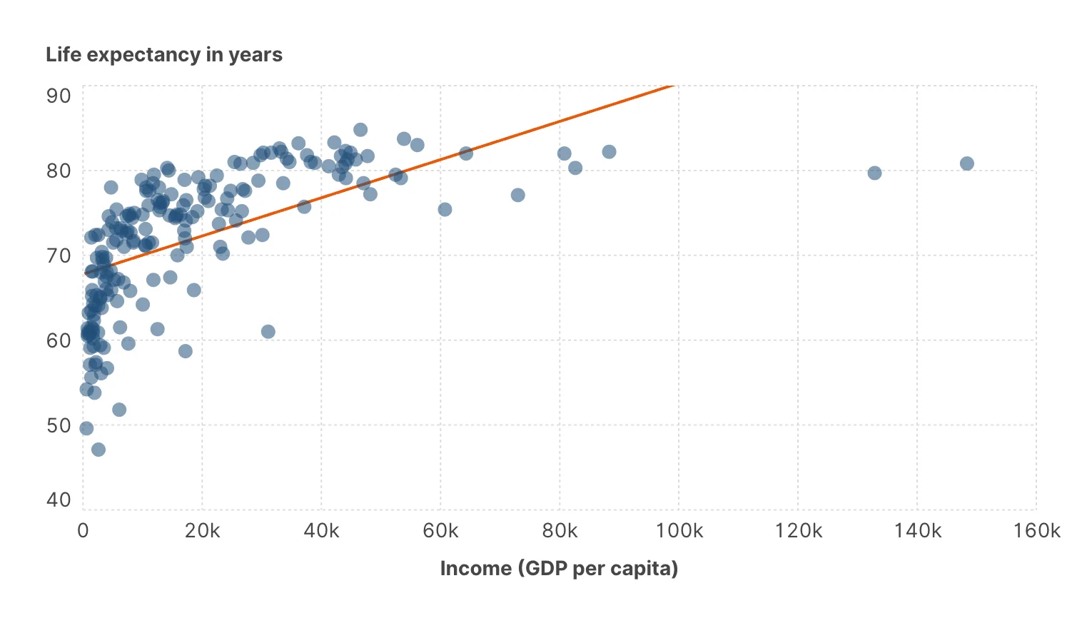
| Linear regression | The straight line of best fit. |
| Exponential curve | A fit for growth that compounds. |
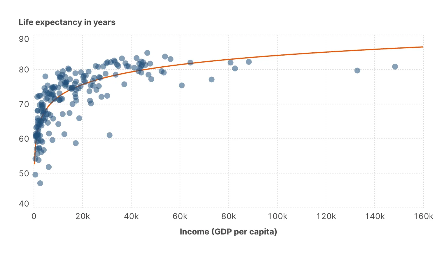
| Logarithmic curve | A fit for rapid early change that flattens out. |
| Power law curve | A fit for relationships that are straight on log-log axes. |
| Polynomial curve | A curve of a degree you set. |
| Average | A line at the mean. |
| Moving Average | A smoothed series over a window you define. |
| Median | A line at the median. |
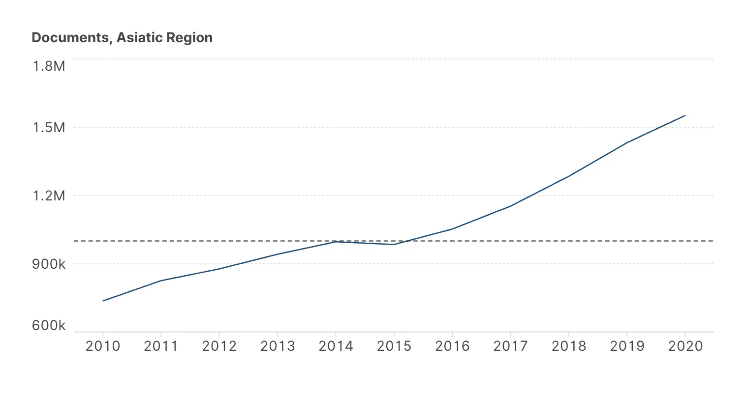
| Constant | A line at a value you type — a target, a limit, a threshold. |
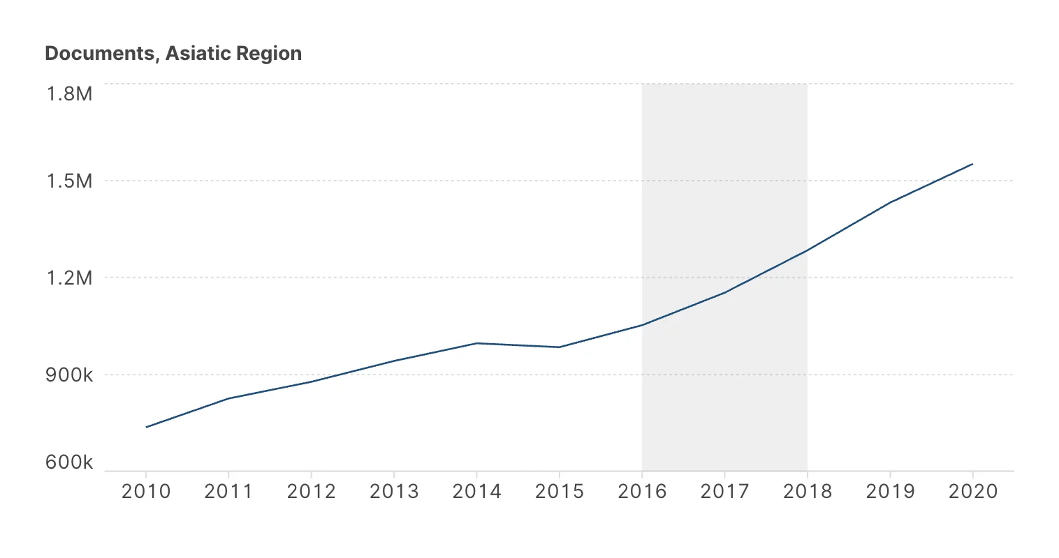
| Interval | A shaded band between two values. |
Appearance is controlled alongside: colour, opacity, width, and a stroke style of solid, dotted or dashed. The convention worth keeping is to make reference lines visually subordinate to the data — thinner, lighter, dashed. They are annotation, and a fit line heavier than the marks it describes inverts the chart's priorities.
Regressions and curves
The five fitted options all answer "what shape does this relationship have?", and they differ in the shape they assume. That assumption is yours, not the chart's: every one of them will fit any scatter you point it at and return a confident-looking curve.
- Linear when you expect a constant rate of change.
- Exponential when the rate is proportional to the level — growth, decay, compounding.
- Logarithmic when returns diminish.
- Power law for scaling relationships; a straight line on log-log axes is the signature.
- Polynomial when the relationship genuinely turns. Set the degree deliberately and keep it low — a high-degree polynomial will pass beautifully through your points and predict nonsense between them.
Adding a trend line asserts that the relationship has that shape. Readers take it as analysis, not decoration, and a line through a cloud with no relationship still looks like a finding.
Before you keep one, check that the marks actually follow it, that the fit is not being carried by two or three extreme points, and that the shape you chose has some reason behind it beyond looking tidiest.
Linear regression
Logarithmic curve
Averages, medians and moving averages
These make no claim about shape, which makes them the safest annotations available.
An average or median line turns every mark into a comparison — above or below — without asserting a relationship. On a bar chart of regions, a median line immediately splits the chart into the halves the reader was going to compute anyway.
A moving average is the tool for noisy time series. You set how many points before and after each one enter the window, and the two are independent: a window that only looks backwards is causal and lags the data, while a symmetric window centres the smoothing but uses future points, which is fine for description and wrong for anything resembling a forecast.
Constants and intervals
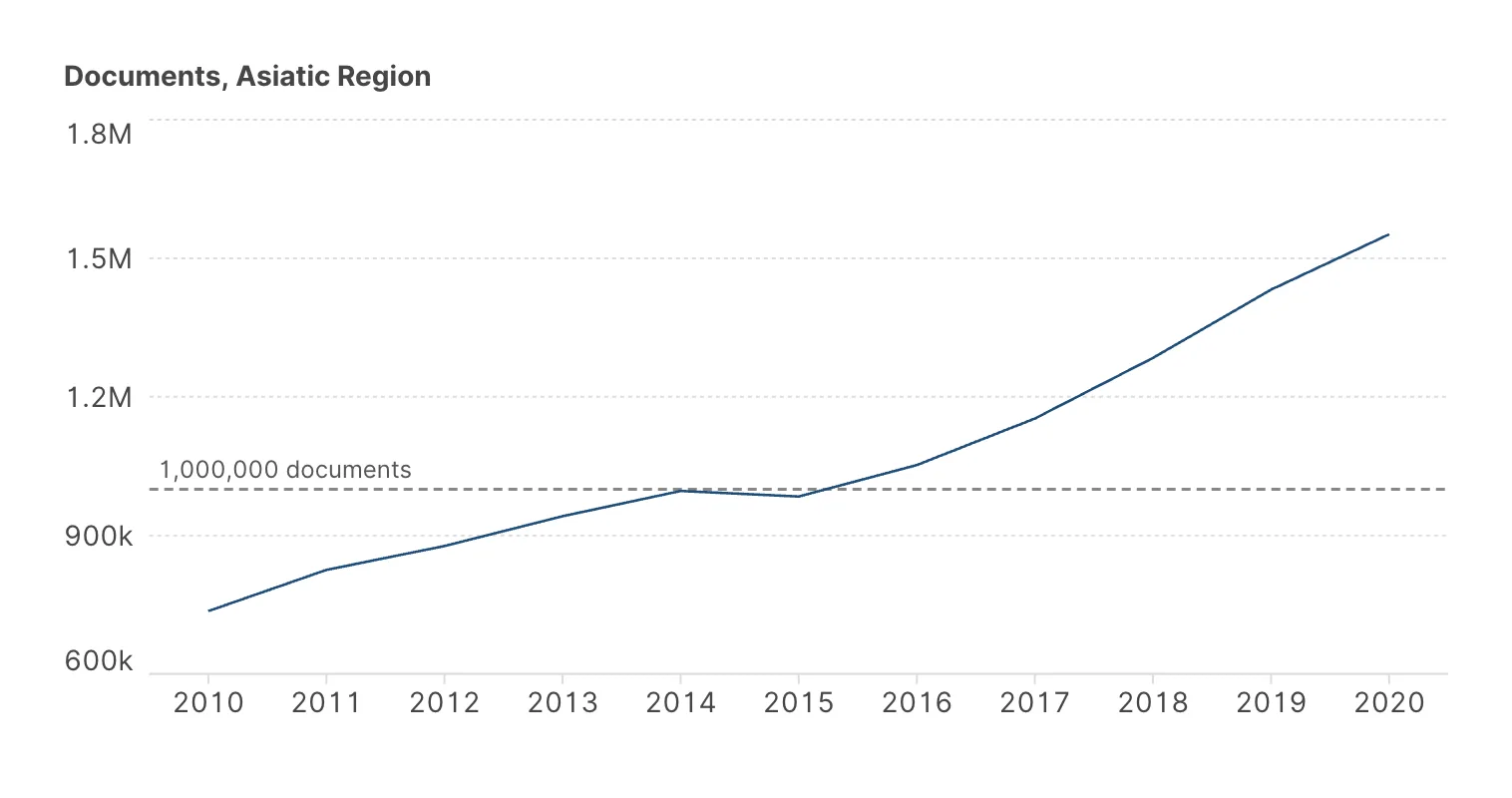
A constant is a line at a value you type: a target, a regulatory limit, last year's figure, a break-even point. It is the most under-used option in the list, and often the one that makes a chart mean something — a bar chart of emissions is data, and the same chart with the target drawn across it is an argument.
Constants can run either way. Type chooses the orientation — horizontal, vertical or both — and X axis constant holds the value for the vertical case, so you can mark a date or an x-value as readily as a y-value.
An interval shades a band between two values: an acceptable range, a confidence band, a period of interest. There is a second pair of bounds for an interval on the x-axis, which is how you shade a span of time — a recession, a policy change, the months a measurement was unreliable.
Because the dropdown takes one option, a chart carries either a constant or an interval, not both.
Constant — a threshold at one million documents
Interval on the x-axis — a shaded period
Labelling a line
Average, median, constant and interval lines can carry a label. Tick Show label at the end of the section and click the text below it to edit it, with bold, colour or a second line if you need them: [value] stands for the value of the line, so Target: [value] becomes "Target: 1.5". The value is written in full, with the number format of the variable on its axis — 42,000 where the axis says 42k — and on an interval it is the range between its two bounds. On the chart, right-clicking the label opens the same editor.
The Position control draws the line it describes and places the label around it: above or below, at the start, the centre or the end. On a vertical line the text runs along the line, from bottom to top, and the control turns to match; on an interval the label sits inside the band, against the edge you pick. Font, Font size and Color style the text, and Show text stroke outlines it in the colour you choose, so it stays readable over grid lines or a shaded band. Like the line, the label is drawn behind the marks.
![The Label settings under Reference lines: Show label ticked; the text [value] documents, with a pencil to edit it; Position, a strip with a horizontal line across it and three slots above and three below, the top-left one selected; Font Inter and Font size 12px; Color #555555; and Text stroke, with Show text stroke unticked and its colour #FFFFFF.](/images/manual/reference-label-settings.webp)
A label turns a line into a statement — "EU target", "Pre-crisis median" — and spares the reader from estimating the value against the axis. Keep it short: it is annotation, like the line. For a note at a single point rather than along a line, right-click that point and add an annotation — see Annotations.
Reference lines and small multiples
With small multiples, Independent reference lines decides whether each panel gets its own line computed from its own data, or whether one line computed across everything is repeated in all of them.
Both are useful and they say opposite things. Independent lines describe each panel's internal trend. A shared line lets you see which panels sit above the overall level and which below — usually the more interesting question, and usually the one small multiples were made to answer.
Narrowing an axis with min and max hides marks from view but leaves them in the calculation: a regression or an average still counts the points outside the frame.
If you want outliers excluded from the maths as well as the picture, remove them with a filter — see An introduction to filters.
Where to go next
Reference lines summarize a relationship with a single line. Distribution plots summarize the spread instead.