
Part I · Fundamentals · Chapter 6
How to create a chart
There are two buttons at the end of the tab bar and they represent two ways of working. One opens an empty chart for you to build. The other opens the wizard, which asks what you have and offers the charts that fit. Neither locks you in: both produce the same kind of editable chart.
Starting with the wizard
The wizard is the faster route, and it is the better one when you are not yet sure what the data supports. It asks two questions in one dialog.
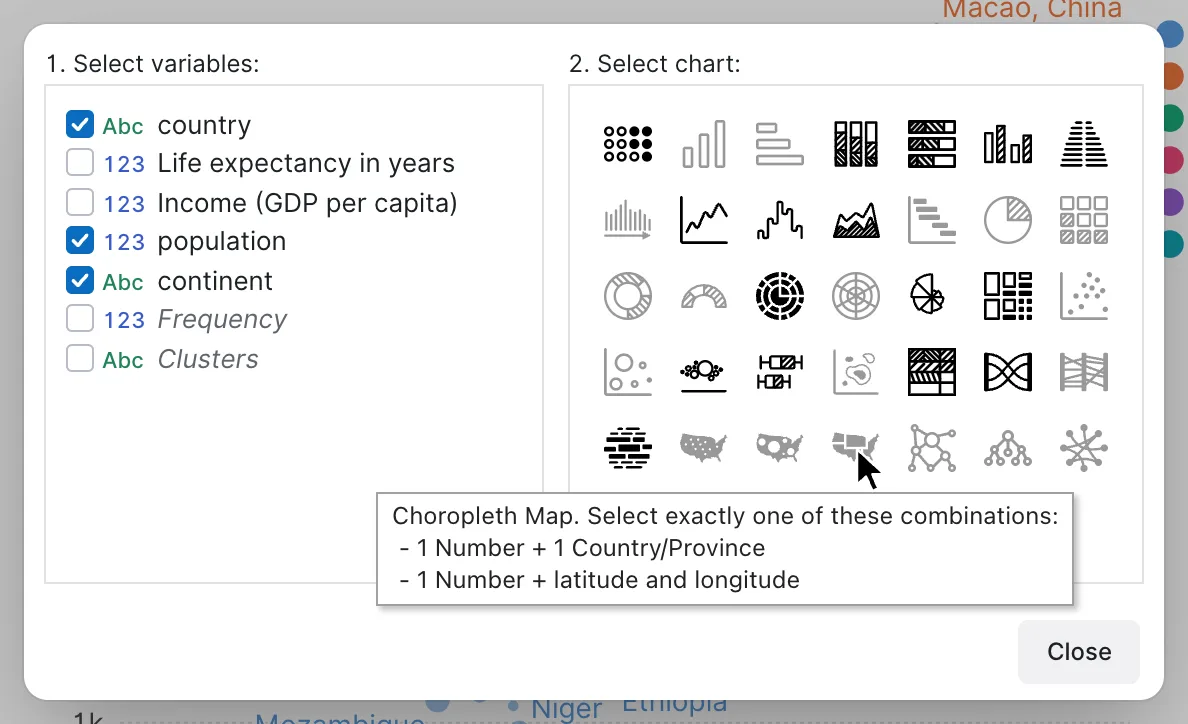
1. Select variables: — tick the columns you want in the chart. All of them are listed with their type icon; computed variables appear in italics so you can tell them from the ones that came with your file.
2. Select chart: — the gallery beside it updates as you tick. Charts that can be built from your selection are active; the rest go grey. The match is exact: a chart stays grey if you tick one variable too many, as much as one too few. Hovering a grey one lists the selections it accepts:
Treemap. Select exactly one of these combinations:
- 1 String + 1 Number
- 2 Strings + 1 Number
That message is the most useful part of the wizard, because it is also a quick way to learn what each chart type fundamentally is. A treemap needs something to divide and something to size. A network diagram needs links. A choropleth needs a geographic column.
Pick an active chart and Graphica opens a new tab with the encoding already written — variables assigned to properties, mark type chosen, relevant settings adjusted. From that point it is an ordinary chart: change anything you like.
What the gallery holds
Thirty-seven chart types, which is fewer than it sounds once you see the families they fall into:
| Family | Charts |
|---|---|
| Comparison | Column, Bar, Stacked Column, Stacked Bar, Clustered Column, Diverging Bar, Dot Matrix |
| Over time | Line, Stepped Line, Area, Gantt |
| Part-to-whole | Pie, Donut, Semi Circle Donut, Waffle, Sunburst, Radar, Rose, Treemap |
| Relationship | Scatter Plot, Bubble, Beeswarm, Heatmap, Parallel Coordinates |
| Distribution | Histogram, Box Plot, Density Plot |
| Flow and text | Alluvial Diagram, Word Cloud |
| Maps | Dot Map, Bubble Map, Choropleth Map |
| Networks | Network Diagram, Tree Graph, Arc Diagram, Non-ribbon Chord Diagram, Time-based Network Diagram |
Every one of them is a set of encodings, not a special mode. A bubble chart is a scatter plot with a variable on Size; a stacked bar is a bar chart with a variable on Subdivision. Once encoding makes sense you will be able to read the gallery this way, and to get to anything in it without the wizard.
Starting empty
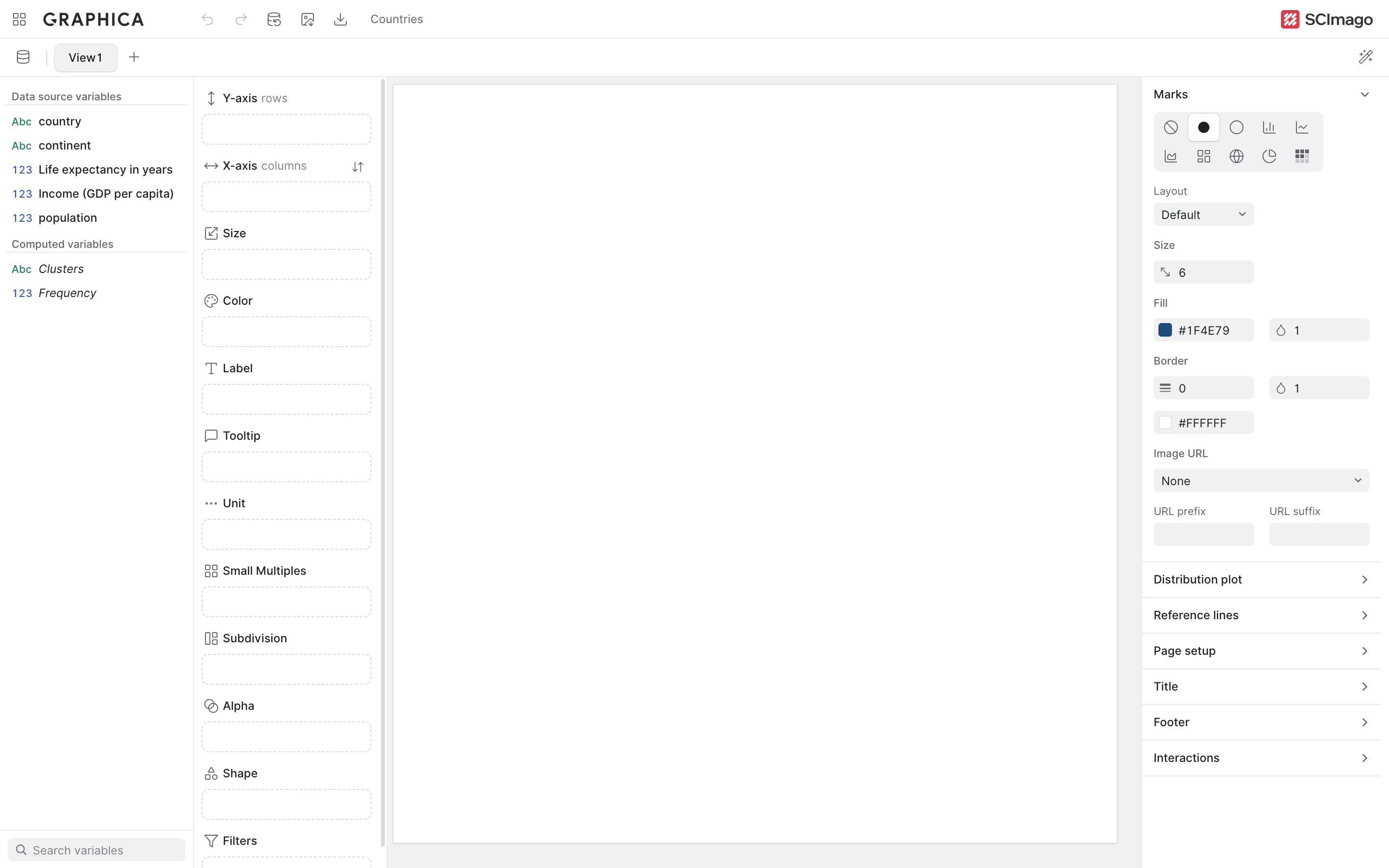
The other button adds a blank chart. Nothing is assigned and nothing is drawn: the canvas stays empty until you make a first decision — put a variable on a property, or change any setting, such as the mark type or the layout.
This is the right starting point when you already know what you want, when you are building something the gallery does not cover, or when you are learning — an empty chart makes the relationship between one encoding and one visual change impossible to miss.
Working with several charts
Charts are tabs, and one project usually ends up holding several. They share the dataset, so a fix to the data reaches all of them, but their encodings and settings are entirely independent.
Two habits pay off. Keep exploratory charts rather than deleting them — they cost nothing and they are how you remember what you already looked at. And rename the tabs, by double-clicking, once there are more than about three; View4 tells you nothing a week later.
If the chart looks wrong
Two causes account for most of it, and both are covered ahead:
- The numbers are bigger than expected. Several rows are landing on the same mark and being added together. That is aggregation, and the fix is usually to choose a different function or a different unit.
- A variable will not go where you want it. The channel does not accept that type, or already holds a variable. An introduction to encoding lists every rule and the exact message you will see.
Where to go next
You have a chart. An introduction to encoding is the chapter that explains why it looks the way it does — and it is the one to read properly, because everything after it assumes it.