
Part I · Fundamentals · Chapter 7
An introduction to encoding
A chart in SCImago Graphica is a set of connections between the variables in your data and the visual properties of the marks on the canvas. Making those connections is called encoding, and it is the one idea the rest of the manual builds on.
Marks and channels
Everything drawn on the canvas is a mark — a dot, a bar, a line, a slice, a country on a map. A mark has visual properties you can see: where it sits, how big it is, what color it takes, what shape it uses, what text rides on top of it.
Each of those properties is a channel you can connect a variable to. Connect Population to Size and every mark is scaled by its population. Connect Region to Color and every mark is colored by the region it belongs to. Nothing else changes: the same marks, re-described.
This is why a scatter plot, a bar chart and a treemap are not three separate tools in Graphica — they are three sets of connections. The chart wizard does present them as a gallery, and it is a perfectly good way to start, but what it hands you is an encoding like any other. Change the connections and the chart becomes something else, which is what makes exploring a dataset fast once the idea clicks.
Where encoding happens
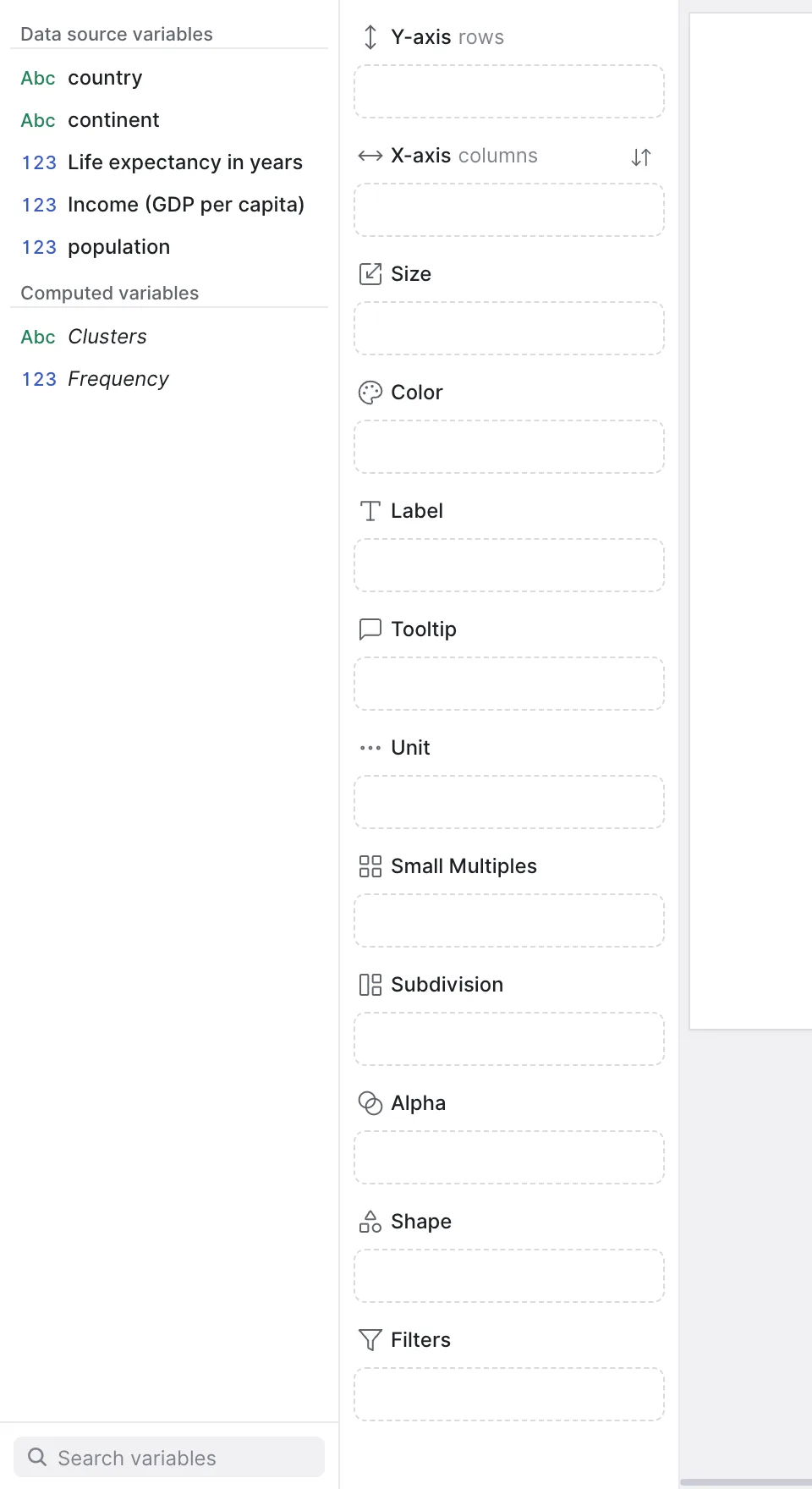
The left side of a chart tab holds two columns. First, the variables in your dataset. Next to them, the visual properties, one drop area each.
The variable list is split into Data source variables — the columns that came in with your file — and Computed variables, the ones you derived. Inside each group the variables are ordered by type: dates first, then categorical, then quantitative. If the list is long, the Search variables box at the foot of the list fades out, as you type, every variable whose name does not match.
Making a connection
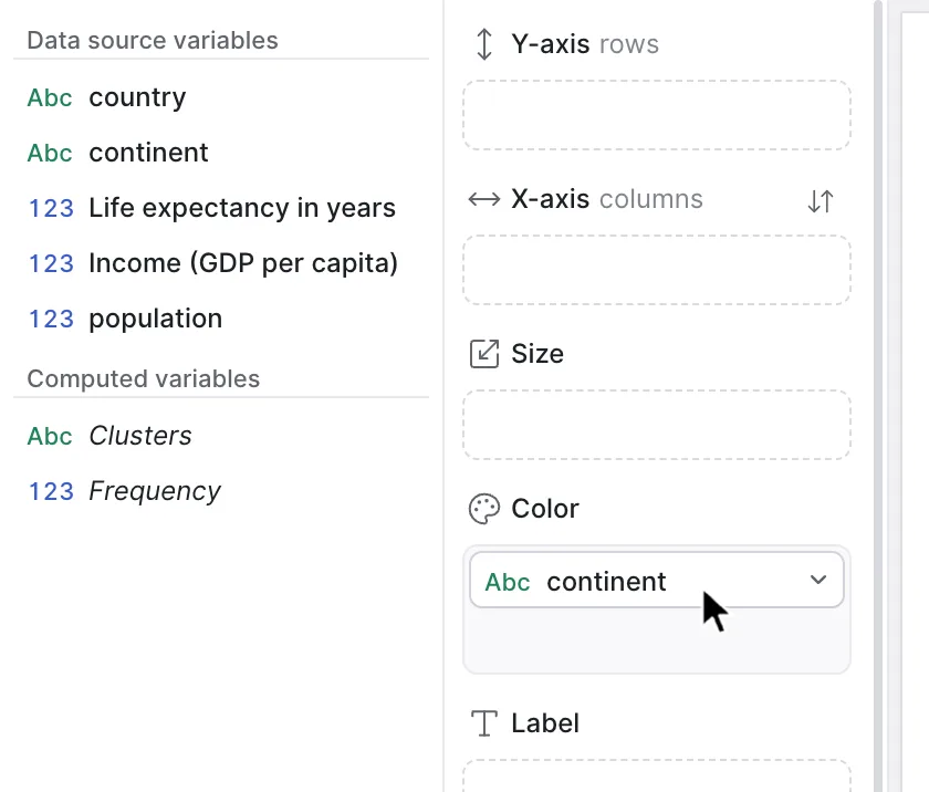
Drag a variable from the list and drop it on the property you want it to drive. The variable stays in the list — you are dropping a copy, so the same variable can feed several channels at once. The chart redraws as soon as the drop lands.
Once a variable sits in a property, two things are available on it:
- Click it to open its settings. Every channel has its own — a scale for an axis, a palette for color, a size range, a text template for a label. Those settings are the subject of later chapters.
- Right-click it and choose Remove to disconnect it. The variable goes back to being unused; the data is untouched.
The twelve channels
These are the properties you can encode to, in the order they appear in the panel. The second column is the name the property carries inside a .gph file, which you only need if you are reading or writing project files by hand.
| Property | In the file | What it does | Accepts | Variables |
|---|---|---|---|---|
| Y-axis | rows | AXIS_Y | Places the mark vertically, or splits the canvas into rows. | Any | Several |
| X-axis | columns | AXIS_X | Places the mark horizontally, or splits the canvas into columns. | Any | Several |
| Size | AREA | Scales the mark by value. | Quantitative | One |
| Color | COLOR | Colors the mark — a palette for categories, a gradient for numbers. | Any | One |
| Label | LABEL | Writes text on the mark. | Any | Several |
| Tooltip | TOOLTIP | Adds information shown when the reader hovers the mark. | Any | Several |
| Unit | UNIT | Decides what one mark represents. Without it, one row is one mark. | Categorical | One |
| Small Multiples | MULTIPLES | Repeats the whole chart once per value, side by side. | Categorical | One |
| Subdivision | SUBDIVISION | Splits each mark internally by value. | Categorical | Several |
| Alpha | ALPHA | Sets the opacity of the mark by value. | Quantitative or date | One |
| Shape | SHAPE | Gives each category its own symbol. | Categorical | One |
| Filters | FILTER | Restricts which rows are drawn. | Any | Several |
Three of them do something different in kind from the rest, and they are the ones worth understanding early. Unit, Small Multiples and Subdivision do not change how a mark looks — they change how many marks there are and what each one stands for. They get their own chapter next.
Project files also carry a thirteenth property, BLUR, which is not offered in the properties panel. You may see it in a hand-written .gph; you cannot assign it from the interface.
What each channel accepts
Not every variable fits every property, and the restrictions are not arbitrary — they follow from what the channel has to draw.
- Categorical only — Shape, Small Multiples, Subdivision and Unit. Each of these needs a finite set of values to work with: one symbol per category, one panel per category, one slice per category. A continuous number has no such set.
- Quantitative only — Size. Area is a magnitude; it has to be computed from a number.
- Quantitative or date — Alpha. Opacity is a magnitude too, but a date is an ordered scale, so it can drive one.
- Anything — the two axes, Color, Label, Tooltip and Filters. These adapt: an axis fed a number becomes continuous and fed a category becomes a set of bands; color switches between a palette and a gradient the same way.
If a variable is not the type a channel expects, changing the type is often the real fix rather than choosing another channel — a year read as a number behaves differently from a year read as a date. See Data types.
One variable or several
Some properties hold exactly one variable, and dropping a second replaces nothing — it is simply rejected. Size, Color, Alpha, Shape, Unit and Small Multiples are all single-variable: a mark has one area, one color, one opacity, one symbol.
The rest take as many as you need. Two variables on X-axis | columns nest one scale inside the other; several on Label or Tooltip stack into one block of text; several on Filters apply together.
When you put several variables on the same axis, categorical variables have to come before quantitative ones. The axis is read outside in: the categories divide the space, and the numbers are measured inside each division. Dropping them the other way round is reported as The categorical variables must precede the quantitative ones in this axis.
Several quantitative variables on one axis
Putting two or more numbers on the same axis — revenue and cost on X-axis | columns, say — splits the plot into one band per variable, side by side, each with its own axis scaled to its own range. That is the right default when the variables are measured in different units, and the wrong one when they share a unit and you meant to compare them: two bars of equal length then stand for entirely different amounts.
The settings that decide this sit in the panel of the axis itself, under Relationship with other axes:
- Synchronize axis — makes every variable on that axis share one scale, taken from the smallest minimum and the largest maximum among them, so the bands are comparable. Turn it on whenever the variables are magnitudes of the same kind; leave it off when they are not.
- Axis organization — offered when the axis holds exactly two variables. Independent is the side-by-side arrangement above; Dual overlays both variables in one plot with an axis on each side of it; Combined merges them into a single axis with a single scale.
When an assignment is not valid
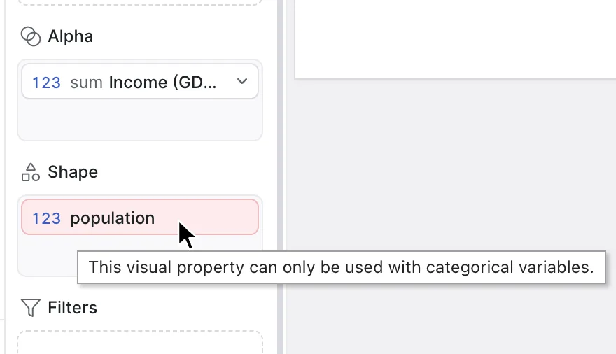
An assignment Graphica cannot honor is not thrown away. It stays where you dropped it, marked as invalid, and hovering it tells you why. That way you can see the whole arrangement you were aiming for and fix the one piece that does not work.
| Message | What happened |
|---|---|
| This visual property can only be used with categorical variables. | A number landed on Shape, Small Multiples, Subdivision or Unit. |
| This visual property can only be used with quantitative variables. | A category landed on Size. |
| This visual property can only be used with quantitative or date variables. | A category landed on Alpha. |
| This visual property can not be assigned to more than one variable. | A single-variable property already had one. |
| This variable has already been assigned to this visual property. | The same variable was dropped twice on the same property. |
| The categorical variables must precede the quantitative ones in this axis. | A category was placed after a number on an axis. |
| This computed variable cannot be used as a filter. | The computed clusters variable was dropped on Filters. |
| This variable is not found in the dataset. | The encoding refers to a column the current data does not have — usually after opening a project against a different file. |
Channels that bring a legend
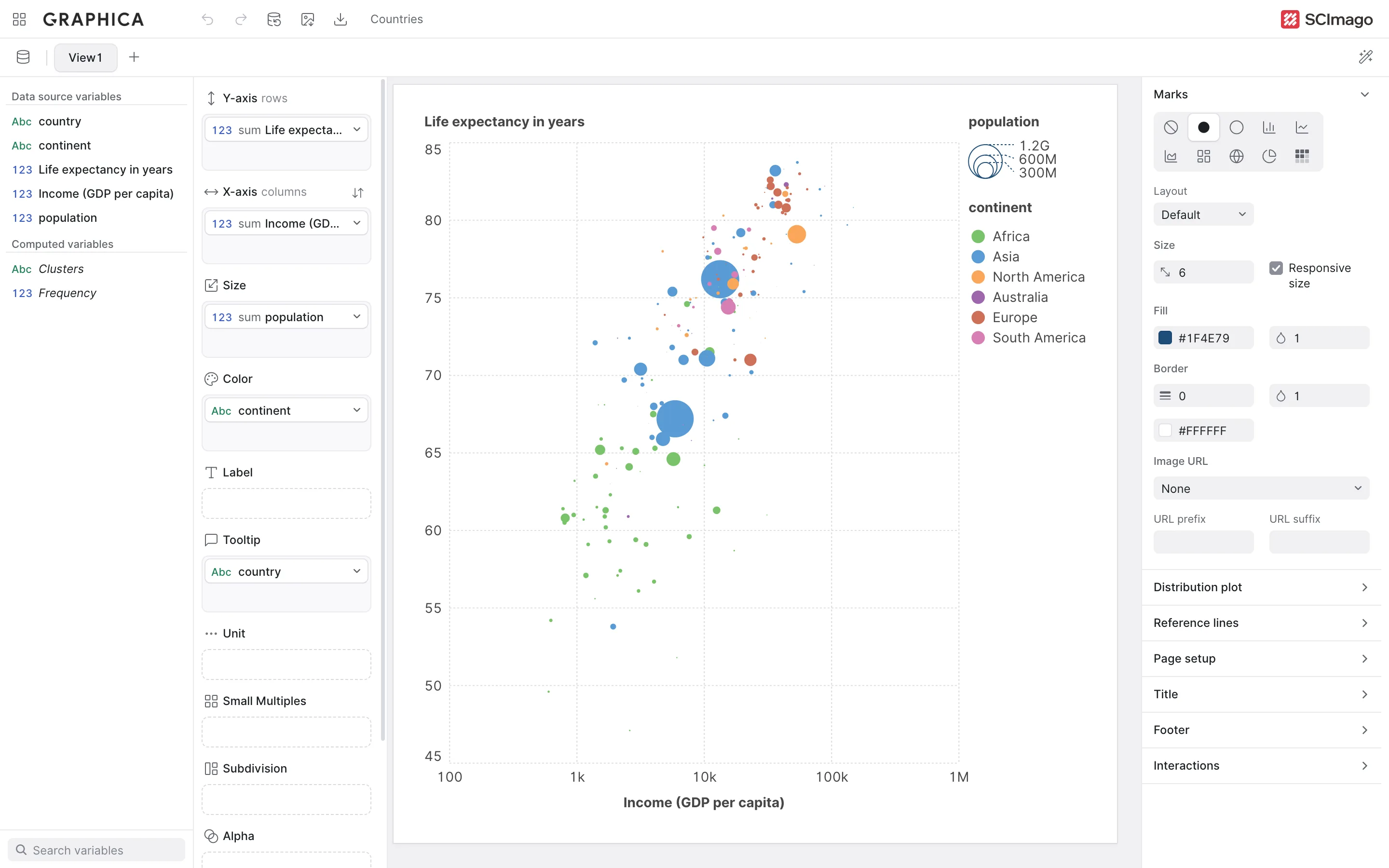
Four channels describe the marks in a way the reader cannot infer from the canvas alone, so Graphica adds a legend for them automatically: Size, Color, Shape and Alpha. The axes need no legend — they have their own scales — and the remaining channels either restructure the chart or write on it directly.
The size legend is the exception worth knowing: it is only drawn when the mark is a circle or a line, the shapes whose area reads reliably. Encode Size on a bar chart and the bars will scale, but no size legend appears.
Choosing a channel
Once the mechanics are second nature, the question stops being can I and becomes should I. Channels are not equally precise. Readers compare positions accurately, lengths almost as well, then areas, then color intensity, and they barely compare opacity or symbol at all.
A practical order for building a chart follows from that:
- Put the comparison your chart is about on the axes.
- Use Color for the grouping you want the reader to notice second — categories, or a magnitude you want scanned rather than measured.
- Use Size for a magnitude that adds context but does not need to be read exactly.
- Use Shape and Alpha sparingly, for a small number of categories or a secondary distinction.
- Put everything else the reader might want on Tooltip, where it costs no ink.
The rule of thumb that survives longest: a channel that has to be decoded twice is a channel that is doing too much. Four encoded variables on one chart is usually plenty, and Small Multiples is often a better answer than a fifth.
Where to go next
The next chapter covers the three channels that restructure the chart rather than restyle it — Unit, Subdivision and Small Multiples — and with them the difference between a chart with one mark per row and a chart with one mark per group. From there, An introduction to aggregation explains what happens to the numbers when many rows collapse into one mark.