
Part II · Advanced topics · Chapter 6
Part-to-whole and hierarchies
Some charts are about position and some are about proportion. This chapter covers the second kind — pies and donuts, waffles, rose and radar charts, treemaps and alluvial diagrams — and they all come from the same two moves: pick a mark, and subdivide it.
The one idea
Nothing in this chapter is a chart type you switch to. Each of them is a mark shape plus Subdivision, and once that clicks the family stops needing to be memorized:
| Chart | Mark | Plus |
|---|---|---|
| Pie | Circle | A category on Subdivision |
| Donut | Circle | The same, with an inner radius above zero |
| Semi-circle donut | Circle | The same, with a sweep angle of 180° |
| Waffle | Waffle | A category on Color, Subdivision or Shape, counted in cells |
| Rose | Circle, rose variant | Slices of equal angle, varying radius |
| Radar | Circle, radar variant | Several variables read on radial axes |
| Treemap | Rectangle | A category on Subdivision, a number on Size |
| Stacked bar | Bar | A category on Subdivision |
| Alluvial | Alluvial | Two or more categories, as stages of a flow |
A stacked bar and a pie are the same encoding on different marks. That is worth knowing because the choice between them is then purely about which reads better — not about rebuilding anything.
Circular charts
With the mark set to circle, one setting picks the variant: pie, rose or radar. Two more shape the geometry, and they are what produce the familiar named variants:
- Inner radius — zero gives a pie; anything above it opens the hole and gives a donut. The hole is not decoration: it removes the centre, where the angles are hardest to compare, and leaves room for a total in the middle.
- Start angle and sweep angle — where the first slice begins and how much of the circle is used. A sweep of 180° is the semi-circle donut; rotating the start angle puts the largest slice where you want the eye to land.
For rose charts, Mapping by: decides whether the variable drives the Radius of each petal or its Area. This is a real choice with a right answer in most cases: radius exaggerates differences, because a petal twice as long covers four times the area. Mapping to area is the honest option unless you specifically want the amplification.
Radar charts get their own grid and label colours, since the web of concentric rings and radial axes is drawn independently of the marks.
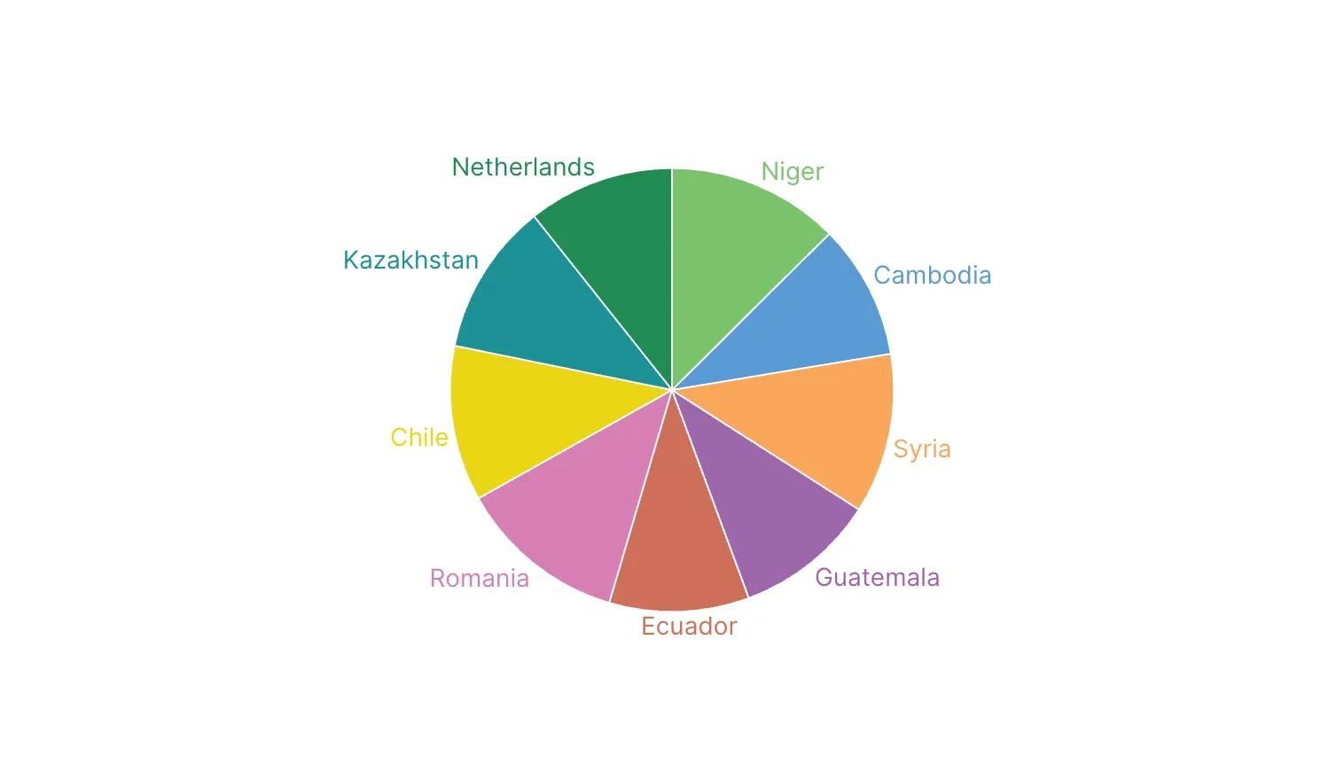
People judge angles poorly. A pie works when there are few slices — three or four — and the point is a rough share rather than a comparison, or when one slice dominates and that is the message.
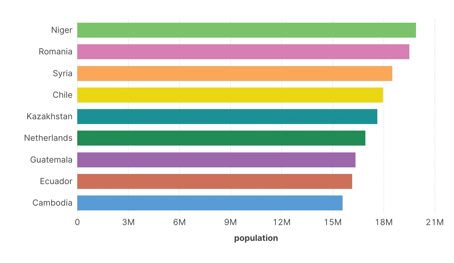
Beyond about five slices, or when slices are close in size, a bar chart answers the same question better. If you find yourself labelling every slice with its percentage because the shapes are not readable, the chart is telling you something.
Pie
Sorted bars
Waffle charts
A waffle is the answer to the angle problem. It takes the pie's encoding — a category on Color or Subdivision, a number on Size, or the row count without one — and draws it as a grid of equal cells, 10 × 10 by default. Each category fills cells in proportion to its value, so 40% is forty cells. Shares are counted rather than estimated.
- The grid is never set by hand. Where a space bounds the waffle — the chart alone, the cells of a categorical axis, a small multiple — its 100 cells take the shape that best fits it: 10 × 10 in a square space, 20 × 5 in a wide one. If the space is so small that 100 cells would be tinier than half a mark of that Size, the waffle drops to 10 cells (5 × 2, 10 × 1), each worth 10%. Where nothing bounds it — a map, a scatter plot — it is a 10 × 10 square whose cells are as big as a circle mark of that size. Fill order decides whether cells fill by rows or by columns, which reads like a stacked bar, and Start picks the corner they fill from: Bottom left makes a waffle that fills upwards, like a rising bar. Corner radius rounds square cells, empty ones and legend samples included.
- Shape divides too: each cell takes the shape of its category, and with Color and Shape on different variables every combination gets its own run of cells. Under Cell shape you can pick a built-in shape or upload an icon of your own; with a variable on Color the icon is painted in the colour of its category — a pictogram.
- Scale decides what a cell is worth. With Part of whole every waffle is a whole of its own, in 100 cells; give it a Whole — 100 when the values are percentages — and each waffle fills only its share of that, with the rest drawn as empty cells. With Proportional every cell is worth the same amount in every waffle: the grid fills the space with cells as big as a circle mark of that Size, each cell is worth the round number with which the largest waffle fills it, the cells left over are drawn empty, and the legend says what one cell is worth. A smaller size gives more, finer cells, and Cell value sets the worth of a cell by hand. That is the setting for comparing waffles side by side.
Values are rounded to whole cells. The leftover cells go to the largest remainders, so the grid always adds up, and a category too small for half a cell can get none. The exact value is still in the tooltip.
Waffles go wherever pies go: one per unit, one per cell of a categorical axis, one per small multiple, or on a map. With Avoid overlap each waffle moves as a block.
Treemaps and hierarchies
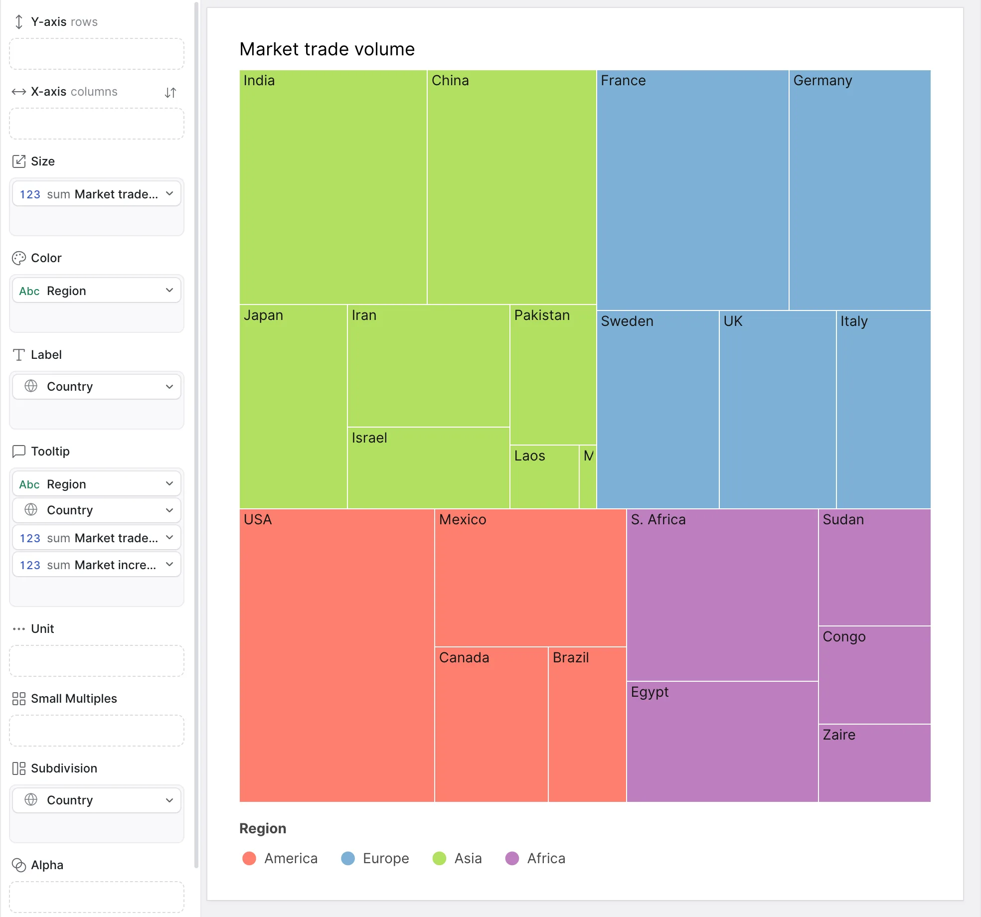
A treemap fills a rectangle with rectangles, each sized by value. It handles what a pie cannot — many categories, wildly different magnitudes — because area survives crowding better than angle, and it nests.
Nesting is the part that catches everyone out, so it is worth stating plainly:
Put the parent level on Color and the child level on Subdivision. Children are then grouped inside their parent and share its colour.
Putting both levels on Subdivision does not nest them — it splits the mark by both at the same level, and the hierarchy disappears.
Sunburst diagrams are the radial form of the same structure, and follow the same rule.
Two practical notes. Label placement matters more here than elsewhere, because small rectangles cannot hold text — Marks to label and Amount of labels to be shown are how you label the blocks that have room and leave the rest to the tooltip. And treemaps have no axes, so exact values are unavailable by construction: readers compare areas approximately and read the rest on hover.
Alluvial diagrams
An alluvial diagram shows how a population divides at one stage and redivides at the next: categories as vertical stacks, flows between them as bands whose width is the quantity moving. It is the chart for composition across stages rather than at one.
It suits questions with a "from what to what" in them — which regions supply which markets, how a cohort moves between categories, where a budget goes on its way from source to use. What it does not suit is a plain breakdown: if there is only one stage, a bar chart is doing the same work with less ink.
Keep the number of stages small. Two or three read well; beyond that the crossings dominate and the diagram becomes a decorative tangle. Sorting the categories at each stage — see the sort options in An introduction to aggregation — reduces crossings considerably and is the first thing to try when one gets messy.
Choosing
| You want to show | Use |
|---|---|
| A rough share, few categories | Pie or donut |
| A share to be counted, or parts of several wholes compared | Waffle, Proportional to compare |
| A precise ranking of parts | Sorted bar chart |
| Many parts, very different sizes | Treemap |
| Two levels of hierarchy | Treemap or sunburst, parent on Color |
| Composition compared across groups | Stacked bars, or small multiples of them |
| Composition changing between stages | Alluvial |
| Several measures for a few entities | Radar — sparingly |
That is the manual
You have the whole grammar now: data in, types corrected, variables encoded onto visual properties, rows grouped and aggregated, filters applied, text and interaction added, and the specialized treatments for maps, networks, clusters, trends, distributions and proportions.
What is left is practice, and the most useful next step is not another chapter — it is the Viz Catalogue. Every example there is a real project you can open in the app and take apart, which is the fastest way to see how the pieces in this manual combine into finished work.