
Part I · Fundamentals · Chapter 11
Labels and tooltips
Two channels put words on a chart. Label writes on the marks, permanently and in the export. Tooltip writes behind them, on demand and only on screen. They look similar in the panel and they solve opposite problems.
Labels
Drop a variable on Label and its value is written on every mark. Several variables can share the channel; their values stack into one block of text.
The difficulty with labels is never getting them to appear. It is that a chart with a label on every mark is usually worse than a chart with none, so most of the settings exist to draw fewer of them, or to make the ones you draw readable.
Which marks get labelled
| Setting | What it does |
|---|---|
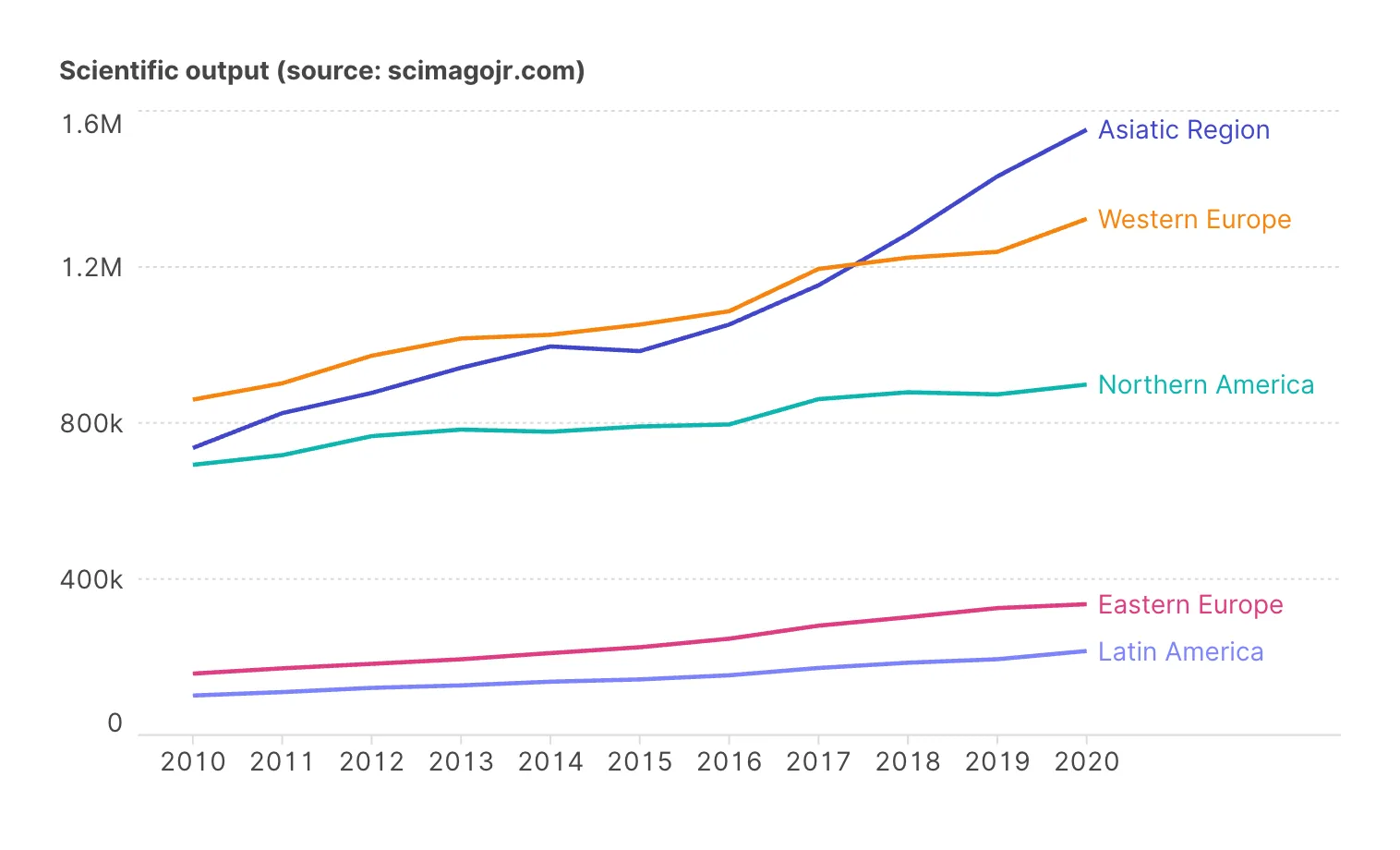
| Marks to label | Auto, All, First, Last, First and last, Min, Max, Min and max. Offered when the mark is a line, where it decides which points of each line carry a label: Last or First and last replaces a legend, and Min and max names each line's extremes and nothing else. |
| Amount of labels to be shown | A fraction from 0 to 1. Thins a dense chart without you choosing which marks survive. |
| Allow overlapping | Off by default: labels that would collide are dropped rather than drawn on top of each other. Turning it on is almost always a mistake. |
Where they sit and how they read
Placement puts the label relative to its mark — Auto, Inside, Top, Bottom, Left & Right, Left, Right or Radial for circular charts. Alignment, vertical alignment and orientation adjust it further.
Legibility is handled by three settings that are worth knowing by name:
- Ensure contrast — on by default. Label color is adjusted automatically so text stays readable against whatever the mark underneath happens to be. It is why dark labels on dark bars rarely happen by accident.
- Show text stroke — draws a halo around the text in a color you choose. This is the setting for labels over a map or a dense scatter, where there is no single background color to contrast against.
- Coloured as the marks — labels take their mark's color. Excellent for line charts, where a label in the line's own color removes the need for a legend entirely; risky elsewhere, since it trades contrast for association.
Labels can also inherit the mark's size, or take their opacity from the mark's opacity or size — useful when you want the label to fade with the thing it names rather than float above it at full strength.
Writing the label text
A label is not limited to a bare value. Label text is a rich-text template: you type the text you want and insert variables into it, so a label can read Spain — 47.4M rather than 47415750.
Inside the template you control formatting the same way you would in the data:
- Numbers — decimal and thousands separators, minimum and maximum decimal places, a prefix such as a currency symbol, a suffix such as a unit, and the abbreviations used for thousands, millions and billions — k, M and G by default on axes and legends, none on Label and Tooltip, where figures are written in full unless you type an abbreviation.
- Dates — the format, the locale used to render month and day names, and whether months appear as a long name, a short name or a number.
Formatting is per variable per property, so the same number can be abbreviated on the axis and written out in full in the tooltip.
Tooltips
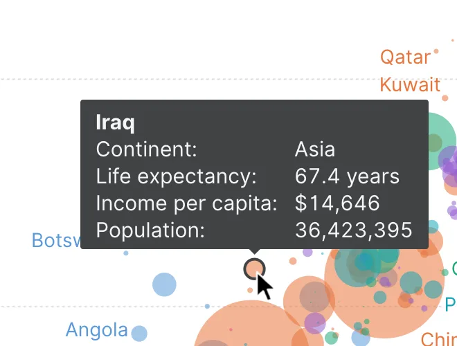
Tooltip works the same way — drop variables on it, compose the text with Tooltip text — and answers a different question. A label is for what the reader must see. A tooltip is for what they might want to check.
That makes it the release valve for a crowded chart. Every variable you were tempted to encode and could not — the exact value, the identifier, the notes column, the two extra measures — belongs here. It costs no space and it does not compete with anything.
| Setting | What it does |
|---|---|
| Shape | The tooltip box: a box with a pointer towards the mark (the default), or a plain box. |
| Background color / Background alpha | Fill and its opacity. |
| Shadow | A drop shadow, to lift the box off a busy chart. |
| Animate | Fade in and out rather than appearing instantly. On by default. |
| Highlight mark | Emphasizes the mark under the cursor while its tooltip is open — so the reader is certain which mark they are reading. |
| Font, size, color, alignment | The text itself. |
A tooltip needs a cursor. It works in the app and in an interactive embed, and it is gone in a PNG or an SVG. Anything the reader of a static export must know has to be a label, an axis, or a note — not a tooltip. This is the most common reason a chart that "worked" turns out to be unreadable once it is in a document.
Titles, footers and axis labels
Three more pieces of text, all rich-text and all with their own font, size, color and alignment:
- The chart title, at the top.
- The footer, at the bottom — where sources, dates and caveats belong.
- The axis and legend titles, which default to the variable name and can be overridden per axis. Overriding is usually worth it: gdp_pc_2023 is a column name, not a label.
An average, median, constant or interval line can carry one more, a label with the line's value written into it; it is set up with the line itself — see Reference lines and regression analysis.
And a note you write yourself, pointing at one mark or at any position of the chart, is an annotation — see Annotations.
Where to go next
Labels write the same thing on many marks. Annotations write one thing, where you choose. Tooltips are the first piece of interaction; Adding interaction covers the rest — highlighting, zoom, interactive legends and clickable marks.