
Part II · Advanced topics · Chapter 5
Distribution plots
An average tells you where a variable sits. A distribution tells you what it is doing — whether the values cluster, spread, split in two, or hide a long tail. Graphica can overlay three summaries on a chart you have already built, and bin values directly on an axis.
The overlay
Distribution plot, a section of the chart settings, adds a summary layer over your existing marks. It does not replace them: you keep the individual points and gain a description of them.
| Option | What it draws | Answers |
|---|---|---|
| None | The default. | — |
| Density map | A heat map of where marks are concentrated, through a five-stop colour gradient you control. | Where is the mass, once there are too many marks to see it? |
| Box plot | Median, quartiles and whiskers per group. | How do these groups compare in centre and spread? |
| Convex hull | An outline around each group of marks, sharp or smoothed. | Where does each group sit, and do they overlap? |
All three share a handful of settings: opacity, fill opacity, border width, and Distribution plot in front — whether the overlay is drawn over the marks or behind them. Behind is normally the right answer, since the marks are the data and the overlay is the description of it.
Density maps
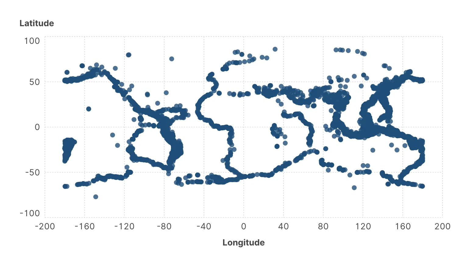
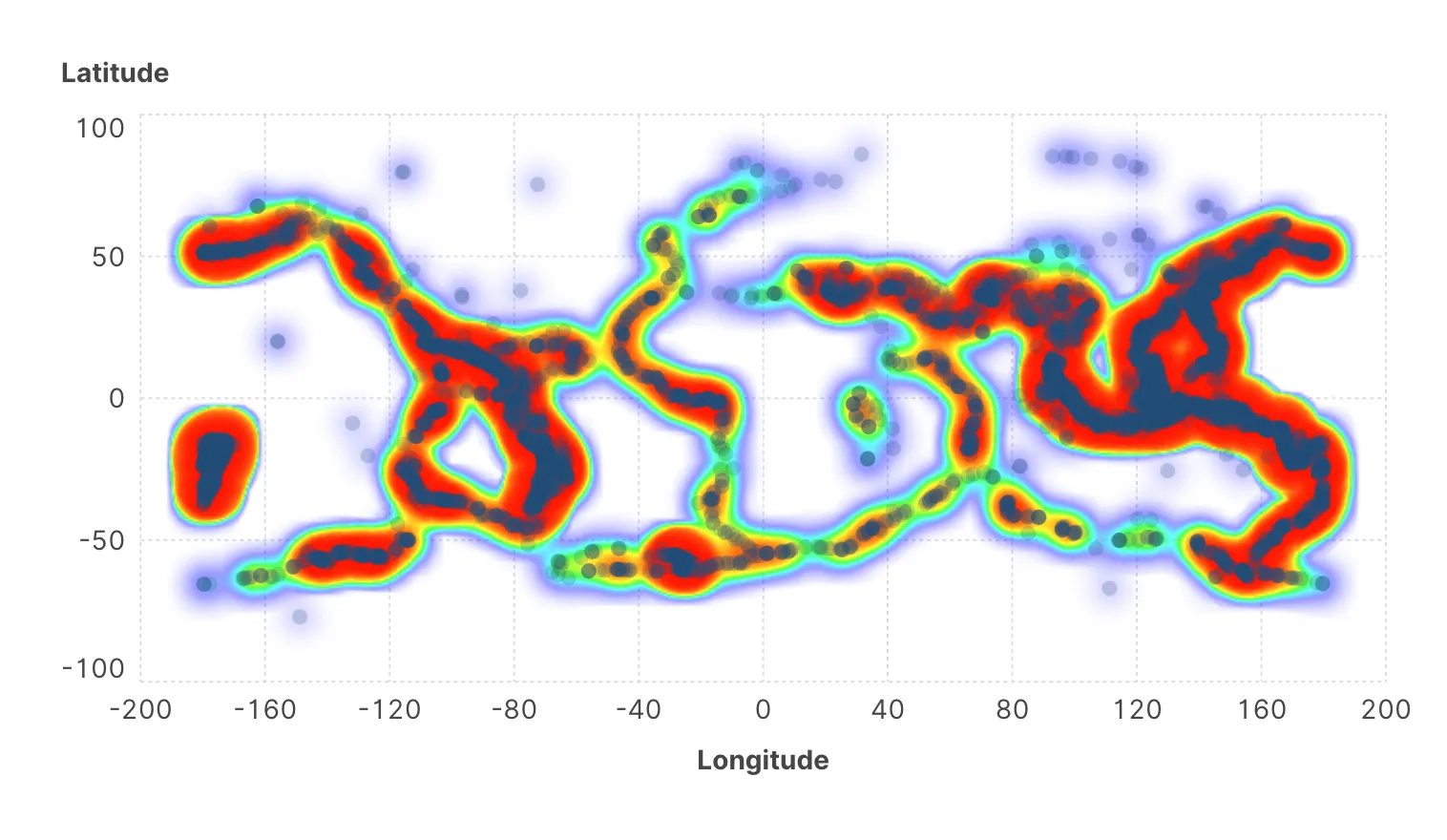
A scatter plot of fifty thousand points is a solid blob: overplotting hides exactly the structure you loaded the data to find. A density map replaces the guesswork with a gradient, so the concentrations become visible even where every pixel is covered.
The five colours of the gradient are set individually under Heat map colors, from lowest density to highest. The default runs pale to saturated, which is the right direction — the eye reads intensity as quantity, and reversing it produces a map that fights its own reader.
Lowering the opacity of the underlying marks and letting the density map carry the structure is usually better than either alone: the individual points remain visible for outliers, and the shape comes from the overlay.
Plain scatter
Density map behind low-opacity marks
Box plots
A box plot compresses a group into five numbers — median, two quartiles, two whiskers — which makes it the efficient way to compare many groups at once. Twenty categories side by side is unreadable as twenty histograms and perfectly readable as twenty boxes.
The settings cover the Style of the box (three icons: filled, hollow, or a plain box), a default colour, Max width, and Use the same color as marks, which makes each box take the colour of the marks it summarizes — so a chart already coloured by category keeps one colour scheme rather than acquiring a second.
A box plot drawn over the individual points is strictly better than one drawn instead of them. The box gives the summary; the points reveal what the summary destroys — bimodality, gaps, a group of four observations pretending to be a distribution.
This is why the overlay is designed as an overlay. Set the marks to low opacity and leave them in.
Convex hulls
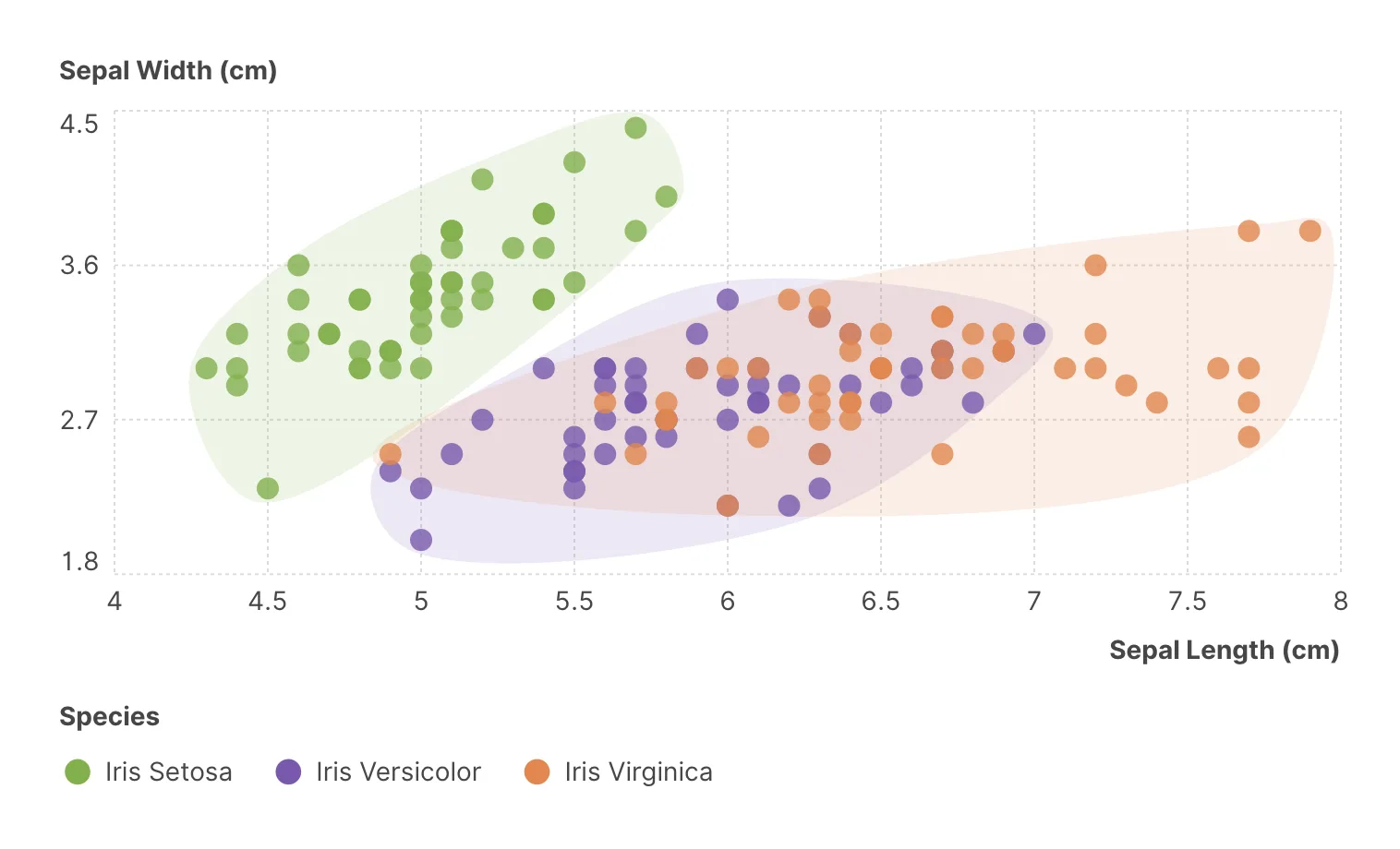
A hull draws an outline around each group of marks. It is the lightest of the three overlays: no statistics, no assumptions, just the boundary of where a group's points fall.
Its value is showing separation and overlap. Two clusters with disjoint hulls are genuinely distinct in the space you are plotting; two whose hulls overlap heavily are not, whatever the colours suggest. That makes hulls a natural companion to clustering — an immediate visual check on whether the groups an algorithm proposed actually separate.
The Style icons choose between sharp, following the outermost points exactly, and smooth, which reads more calmly but implies a boundary slightly larger than the data. Note that a hull is defined entirely by its extreme points: one outlier stretches it across the chart, and the fault is the hull's, not the data's.
Histograms
The overlays describe a distribution on a chart of something else. A histogram is the chart: the values of one variable, binned, with each bar counting the rows that fall in its bin.
The wizard builds one for you, and the setting that matters afterwards is Bin width on the axis. It is worth changing deliberately, because bin width decides what the histogram appears to say: wide bins smooth structure away, narrow bins turn sampling noise into peaks. A distribution that looks bimodal at one width and flat at another is a result about the binning, not about the data — so try two or three before believing any of them.
Choosing among them
| You want to know | Use |
|---|---|
| The shape of one variable | Histogram, or a density plot |
| How several groups compare | Box plot |
| Where the mass is in a crowded scatter | Density map |
| Whether groups separate in two dimensions | Convex hull |
| Whether individual values matter | Keep the marks, whatever else you add |
Where to go next
Part-to-whole and hierarchies is the last chapter — the charts built from proportions rather than positions.