
Part I · Fundamentals · Chapter 13
Adding interaction
A chart on screen can do things a chart on paper cannot: respond to the cursor, let the reader isolate a category, zoom into a crowded corner, or lead somewhere else when clicked. None of it is on by default, because interaction that surprises the reader is worse than none.
Highlighting on hover
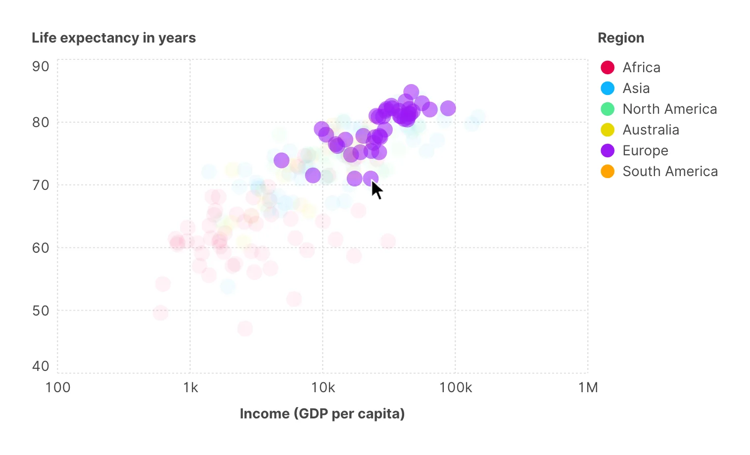
The simplest and most useful of the four. With Highlight elements on hover enabled, in the Interactions section of the chart settings, moving the cursor over a mark brings it forward and fades everything else. Opacity of non-highlighted sets how far the rest fade — 0, the default, hides them altogether; a low value such as 0.1 is a strong spotlight, a high one a gentle emphasis.
The variant worth knowing is Highlight elements with the same color on hover: hovering one mark highlights every mark sharing its color. Since color usually carries a category, this turns any colored chart into one where the reader can isolate a whole series by pointing at a single member of it — without a legend, without a click, and without you building anything.
Interactive legends
A legend can be a static key or a control. The Interactive filter setting on the legend switches between them: None leaves it as a key, Simple makes its entries clickable — clicking one isolates that category and dims the rest, as far as the Filter opacity set beside it — and Multiple lets each click add one more category to the selection.
This is the interaction to reach for first when a chart has more categories than a reader can hold at once. It costs one setting, needs no explanation — everyone tries clicking a legend — and it lets a chart carry ten series while reading as though it carried one.
Zoom
Enable Zoom control and the reader can scale into the chart. Two settings shape the behaviour:
- Auto-zoom — starts the view centred on where the data actually is, instead of on the geometric middle of an empty frame. Useful on maps and on any chart with sparse corners.
- Restrict zoom area — keeps the reader inside a sensible bounding area so they cannot scroll off into empty space and lose the chart. Worth leaving on for anything you publish.
Zoom earns its place on maps and on dense networks and scatter plots — charts where the interesting structure is smaller than the frame. On a chart of twelve bars it is noise.
Clickable marks
Marks can be links. There are two ways to build the URL, and they cover different situations:
| Approach | How it works |
|---|---|
| Prefix and suffix | The value of the Web link variable is wrapped between a fixed Web link URL prefix and Web link URL suffix. Good when your identifiers already fit a URL pattern. |
| URL variable | A column in your data holds the full URL for each row. Good when the links are arbitrary. |
Web link target decides whether links open in a new tab (_blank) or the same one (_self) — normally a new one, since a reader who leaves your chart to follow a link rarely comes back. These settings sit in the Interactions section of the chart settings, and the prefix, suffix and target appear once a Web link variable is chosen. A prefix that starts with a host name, such as www.example.org/, gets https:// in front of it. Besides web pages, links can be mailto: and tel: addresses, which open the reader's email or phone app instead of a page. Axis labels can be made clickable the same way, with their own base, suffix and variable.
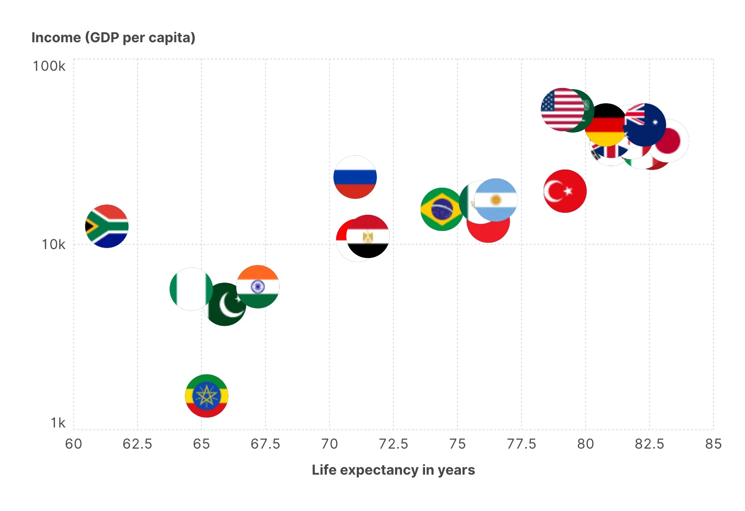
Marks can also be rendered as images pulled from a URL — again by prefix and suffix or from a column, with Image URL, URL prefix and URL suffix under Marks. Flags on a country chart, logos on a company chart, portraits on a people chart: it is the same mechanism as linking, applied to what the mark looks like rather than where it goes.
What survives, and where
Interaction only exists where there is a cursor and a live chart. That is a real constraint on how you design, not a footnote:
| Destination | Interaction |
|---|---|
| The app | Everything works. |
| A project file (.gph) | Everything is preserved — settings included — and works again when opened. |
| PNG | None. A flat image. |
| SVG | None of the behaviours above. The chart is vector graphics, not a live chart. |
If the chart is going into a document, a slide or a paper, it has to work with no interaction at all. Everything essential must be a label, an axis or a footer.
The failure mode is easy to walk into: you build the chart in the app, where hovering answers every question you have, and you never notice that the exported version answers none of them.
A reasonable default set
For a chart that will be read on screen, this combination is hard to improve on and takes about a minute:
- Tooltip carrying the identifier and the exact values.
- Highlight elements on hover on, with Highlight elements with the same color on hover if color carries a category, and Opacity of non-highlighted around 0.1 so the rest stays visible.
- Highlight mark on in the tooltip settings, so the mark being read is unambiguous.
- Legend Interactive filter set to Simple or Multiple if there are more than about five categories.
- Zoom control only if the chart is a map, a network, or genuinely crowded — and then with Restrict zoom area on.
Where to go next
Exporting your visualization is the last chapter of Part I, and it is where the distinction between a live chart and a flat one gets settled.