
Part I · Fundamentals · Chapter 9
An introduction to aggregation
The moment several rows land on the same mark, Graphica has to turn several values into one. That is aggregation. It happens automatically, but not in every chart — and knowing when it is running, and with which function, is the difference between a chart you trust and one you merely believe.
When it happens
Aggregation is not a mode you switch on, and it is not something a chart does merely because a categorical variable is involved. Two conditions have to hold at once:
- The chart is drawing a mark that stands for a group of rows rather than for a row.
- Several rows actually fall into the same group.
The first condition is decided by the Marks setting, and this is the part that catches people out. A categorical variable on an axis does not combine anything by itself — it only decides where marks are placed. What the mark is decides whether they are combined:
| Mark | How many marks |
|---|---|
| Disks, circles and the other point symbols | One per row, always. Twenty rows in the same category draw twenty points in that band, overplotted. Nothing is aggregated. |
| Bars | One bar per group. Rows are combined. |
| Lines and areas | One vertex per group along the line. Rows are combined. |
| Circle charts — pie, rose, radar | One sector per group. Rows are combined. |
| Filled rectangles — treemaps and space-filling charts | One rectangle per group. Rows are combined. |
| Filled maps | One shape per region, through the geographic variable that ends up on Unit — whether you put it there or Graphica did. |
| None | Combined only when both axes carry categorical variables; otherwise one invisible mark per row. |
So a scatter plot of 3,000 rows against a category is 3,000 points, and switching its mark to bars turns it into a handful of totals. Same encoding, same data, entirely different numbers on the axis — because the mark changed.
A variable on Unit groups rows whatever the mark is: that channel exists precisely to redefine what one mark stands for. It is the only way to aggregate a chart of points. See Structural channels.
There are three cases where a grouping mark does not group after all, and they are all charts where each mark genuinely needs its own row: parallel coordinates, an axis set to Combined, and a line whose connection variable is quantitative. A bar in a chart with no quantitative axis is not a bar either — Graphica draws it as a point mark, and it does not group.
What counts as one group
When the mark does group, the grain is every categorical and date variable used anywhere in the chart — both axes, Color, Shape, Subdivision, Small Multiples, Unit, Label and Tooltip. One row comes out per distinct combination of their values, and the quantitative variables are aggregated inside it.
Two consequences are worth internalizing:
- Filters do not count. A variable used only on Filters decides which rows take part; it never splits them further.
- Labels and tooltips do count. Dragging a categorical variable onto Tooltip is not a cosmetic act — it enters the grain, and one bar can quietly become several. If your numbers change when you add a tooltip, this is why.
On bars, areas, circle charts and treemaps the subdivision variable is part of the grain: that is what produces the stacked segments. On lines, points and maps a variable used only on Subdivision is left out of the grain, and the mark is divided after the grouping rather than by it.
Dates enter the grain at whatever precision their own aggregation setting specifies — Aggregating dates, below, covers that. Quantitative variables enter it only when they are being binned: a histogram's axis variable, or a numeric variable on Unit with a bin width.
Two behaviors of the grouping itself are easy to trip over:
- Empty values drop the row. A row with no value in one of the grouping variables is discarded, not gathered into a blank category.
- A unique variable cancels the grouping. If any grouping variable has a different value in every row — an id, a name that never repeats — no two rows can share a group, so nothing is combined and every aggregation function in the chart is inert.
When rows are combined, each quantitative variable is reduced to one number, and by default Graphica adds them up.
Every quantitative variable carries a small badge naming a function — sum, avg, med, min, max — both in the property slots and in the variable list. It tells you which function would apply, not that anything is being combined: a scatter plot of one point per row shows sum badges and sums nothing.
The badge answers "with what?". To answer "at all?", export Output data (CSV) and compare its row count with your data.
Choosing the function
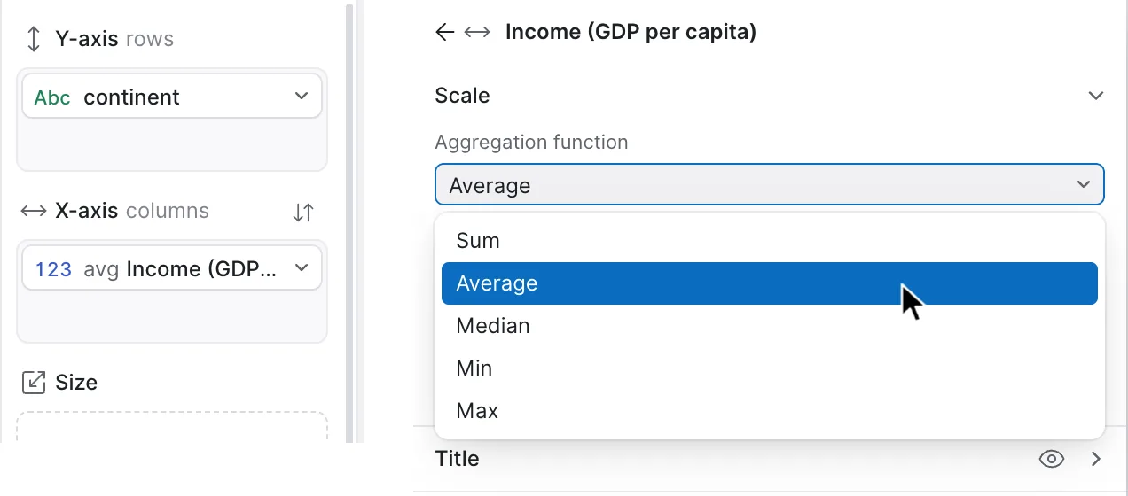
Click the variable in its property and the settings open with Aggregation function first, under Scale:
| Function | Use it for |
|---|---|
| Sum | Quantities that genuinely add up — population, revenue, counts. The default. |
| Average | Rates, scores and per-unit figures, where a total would be meaningless. |
| Median | The same, when a few extreme rows would drag the average around. |
| Min | The floor of a group — earliest, cheapest, worst. |
| Max | The ceiling — peak, latest, best. |
The setting belongs to that variable in that property, not to the variable or the chart. The same column can be summed on the axis and averaged in the tooltip, which is often exactly what you want. Graphica computes all five functions for every group as it builds them, so switching between them is instant and costs nothing.
Summing something that should be averaged. A column of percentages, rates or per-capita figures aggregated with Sum produces numbers that look plausible and are nonsense — five regions at "82% literacy" become one region at 410%.
The rule: if adding two rows of the column together would be meaningless in real life, do not let Graphica add them. Change the function the moment you assign the variable.
Aggregating dates
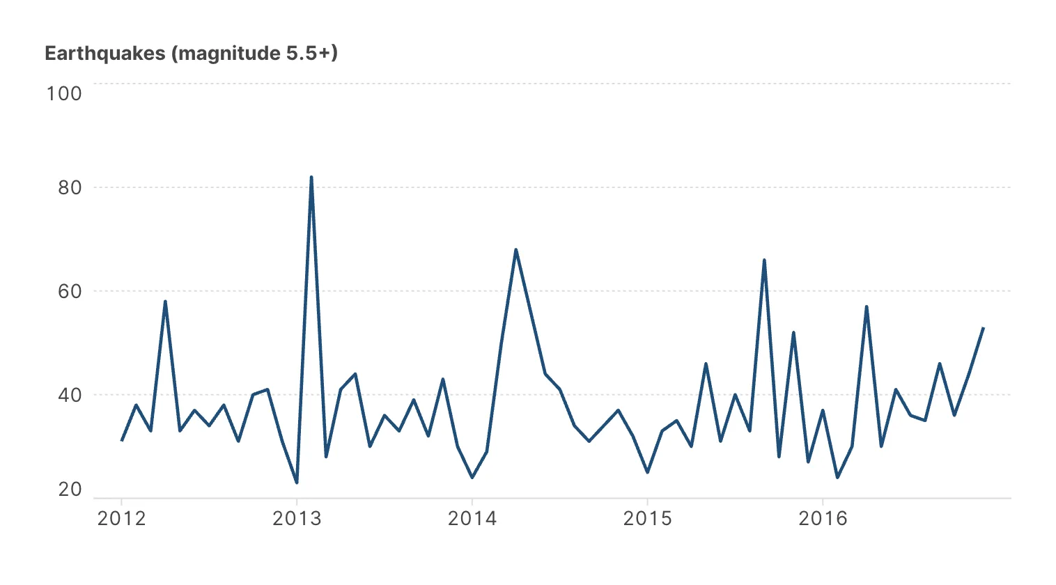
Dates aggregate too, but the operation is different: rather than combining values, it decides how precise the date is. A column of timestamps can be read as years, months or days, and a chart of daily data becomes a chart of monthly data without touching the underlying dataset.
The options split into two kinds, and the distinction matters:
| Kind | Options | What it does |
|---|---|---|
| Truncate | Year, Quarter, Month, Day, Hour, Minute, Second | Keeps time moving forward at a coarser grain. March 2023 and March 2024 stay separate. |
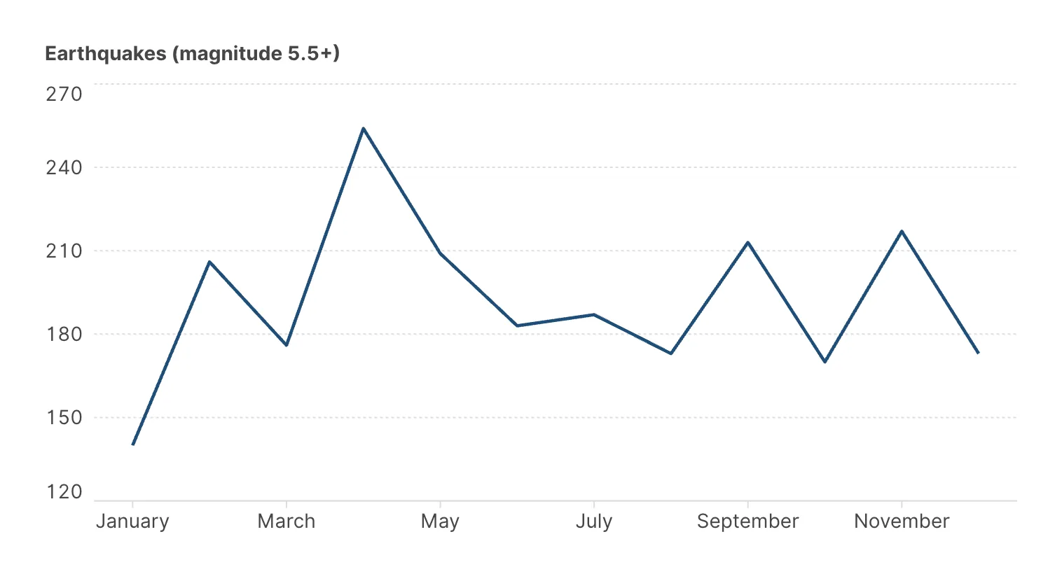
| Cycle | Quarter of the year, Month of the year, Day of the month, Hour of the day | Folds time onto itself. Every March in your data becomes the same March — for seasonality. |
Auto, the default, picks a grain that suits the range of your data. The hour, minute and second options only appear when the column actually carries a time; a date-only column offers the date grains alone.
Date aggregated by Month
Date aggregated by Month of the year
Counting rows
Sometimes the number you want is not in the data: how many rows fall in each category. Graphica keeps a Frequency variable in the Computed variables list for exactly this — it holds 1 in every source row, so summing it over a group counts the rows in it. Put the categorical variable on one axis and Frequency on the other and you have a bar chart of how often each value occurs, without adding a column of ones yourself.
This is what the Histogram entry in the wizard does for a quantitative variable: it bins the values and counts the rows in each bin. The bin width is a setting on the axis, covered in Distribution plots.
Sorting the result
Once rows are grouped, the order the groups appear in is a choice, and it lives beside the aggregation settings:
| Sort type | What it does |
|---|---|
| None | The order the values appear in the data. |
| Alphabetical | By name. Good for lookup, poor for comparison. |
| By Variable | By the aggregated value of another variable — the one you usually want. Choose the variable and the function it is aggregated with. |
| Manual | An order you set yourself, for categories with an inherent sequence. |
Each of these can run ascending or descending. Sorting bars by their own value, descending, is the single cheapest improvement available to most categorical charts.
Checking your work
Three habits catch nearly every aggregation error:
- Know whether the mark groups. If it does not — points, or a chart with a variable unique to every row — no aggregation setting in the panel is doing anything, and a number that looks wrong has a different cause.
- Read the badges on the marks that do group. Glance at every quantitative variable in the panel and confirm the function on each is the one you meant, remembering that the badge appears either way.
- Export the output data. Output data (CSV) in the export menu gives you the aggregated dataset the chart is actually drawing — not your source rows. Its row count tells you whether grouping happened, and its values tell you what went into each mark. See Exporting your visualization.
Where to go next
Aggregation decides how rows combine. An introduction to filters decides which rows are there to combine in the first place.