
Part I · Fundamentals · Chapter 8
Structural channels: units, subdivision and small multiples
Nine of the twelve channels change how a mark looks. Three change what a mark is: Unit decides what each mark represents, Subdivision breaks each mark into parts, and Small Multiples repeats the entire chart. They are the difference between a chart of your rows and a chart of your subject.
Unit: what one mark represents
With a point mark, one row of your dataset is one mark: a file with 3,000 rows draws 3,000 points, whatever is on the axes. For a scatter plot of individual observations that is exactly right, and you never touch this channel.
It stops being right the moment your rows are more granular than your subject. If your dataset has one row per city but your chart is about countries, you want one mark per country. Put Country on Unit and that is what you get: the cities of each country collapse into a single mark — and, unlike the grouping that bars and lines do on their own, Unit does it whatever the mark is.
Two things follow immediately, and both trip people up the first time:
- The numbers change. Twenty cities became one country, so the value shown for that country has to be computed from twenty values. By default they are added. Which function is used, and how to change it, is the next chapter — and it is the other half of this one.
- The mark count drops. Overlapping marks separate, labels that could not fit start fitting, and a chart that was unreadable often becomes obvious. Aggregating is frequently the fix for a cluttered chart rather than a step you take for accuracy.
Unit takes one categorical variable. It is also the channel that carries geography: when the variable is a country or a province, its values supply the map geometry — though on a map Graphica will pick the first geographic column by itself, so you only assign it when you need a different one. That, and the coordinate route that bypasses Unit entirely, is Displaying geospatial data.
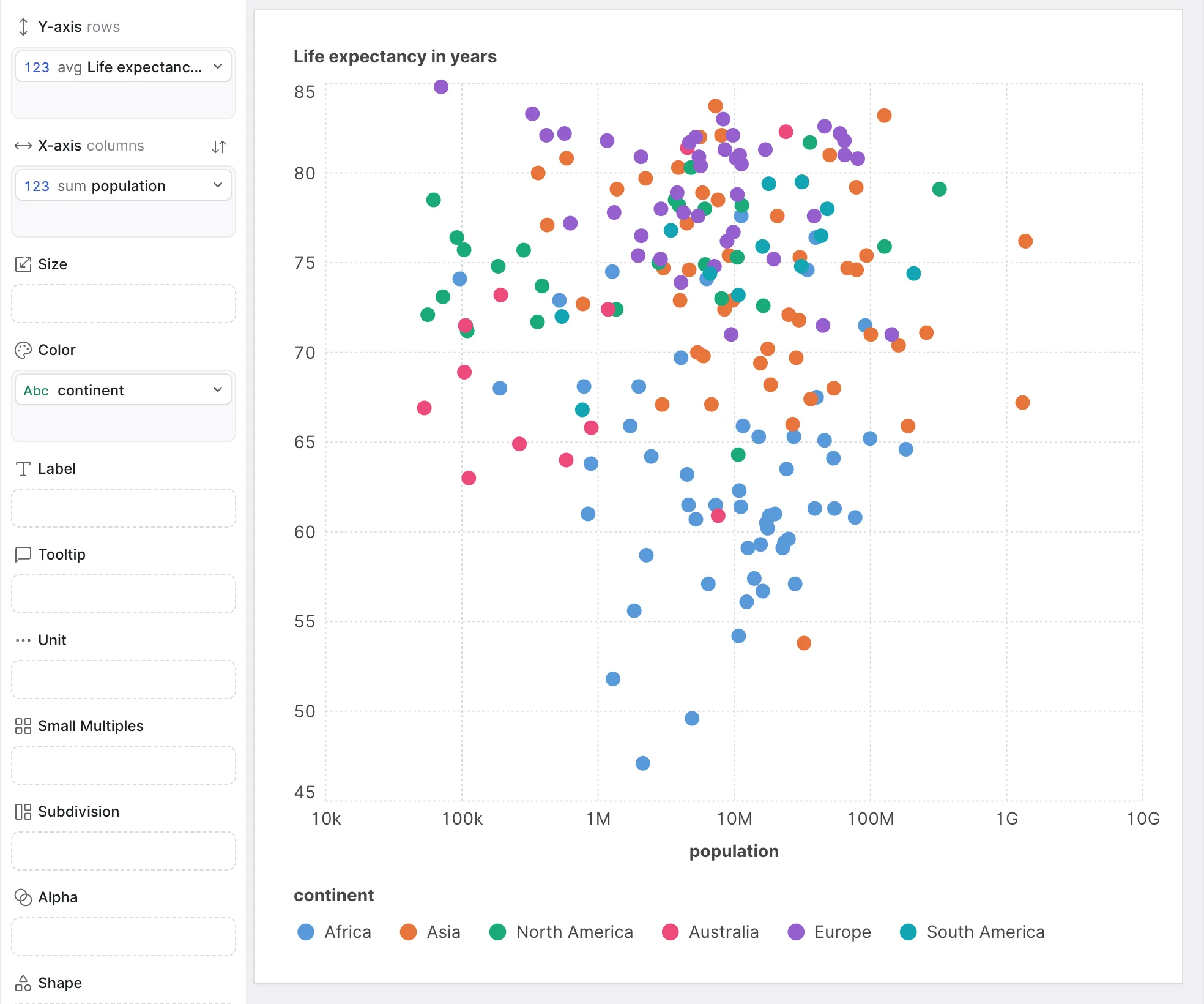
Nothing on Unit — one mark per row (country)
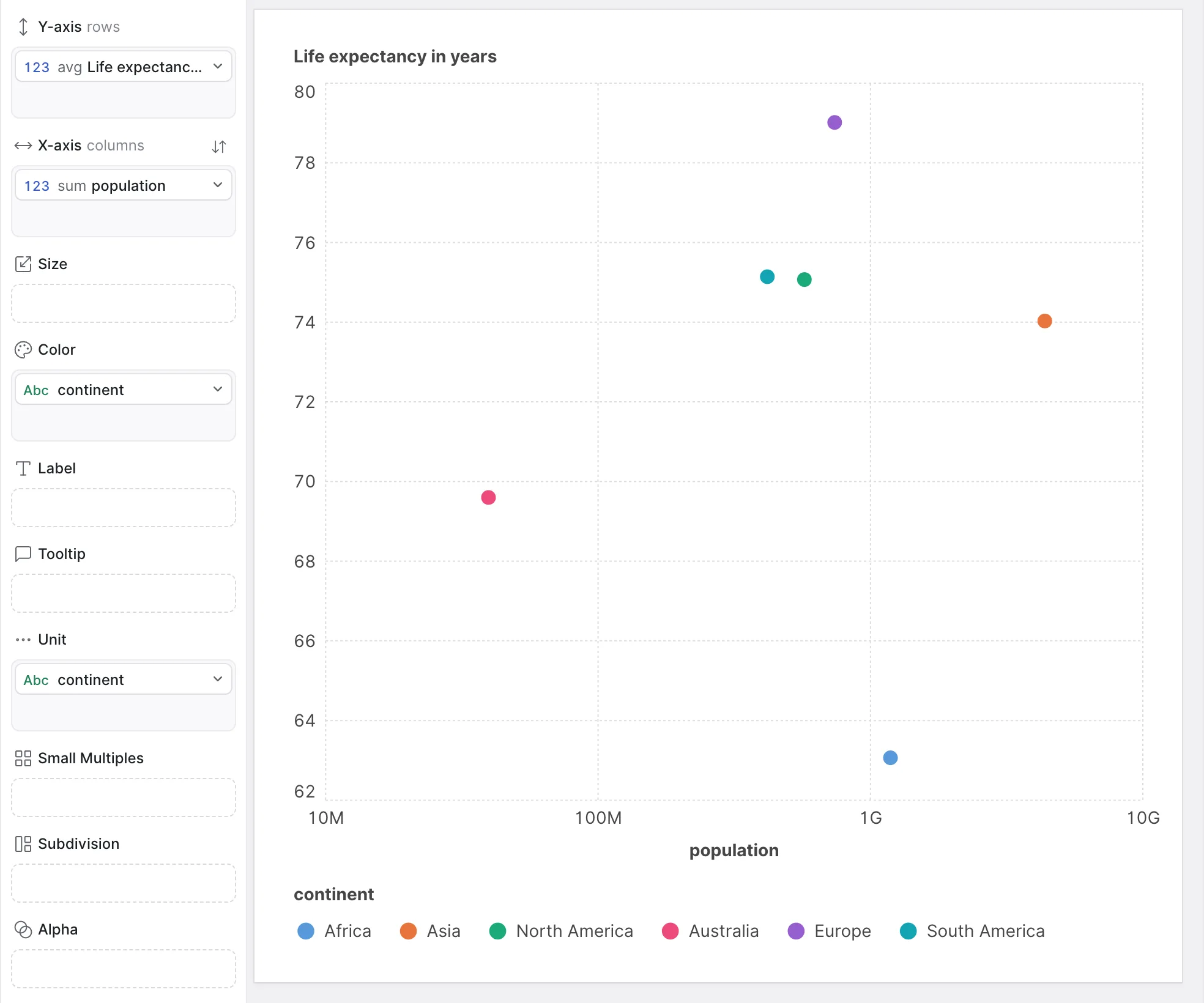
continent on Unit — one mark per continent
Subdivision: parts of a mark
Where Unit merges rows into a mark, Subdivision splits a mark back into visible pieces. The mark keeps its position and total size; inside it, one part per category.
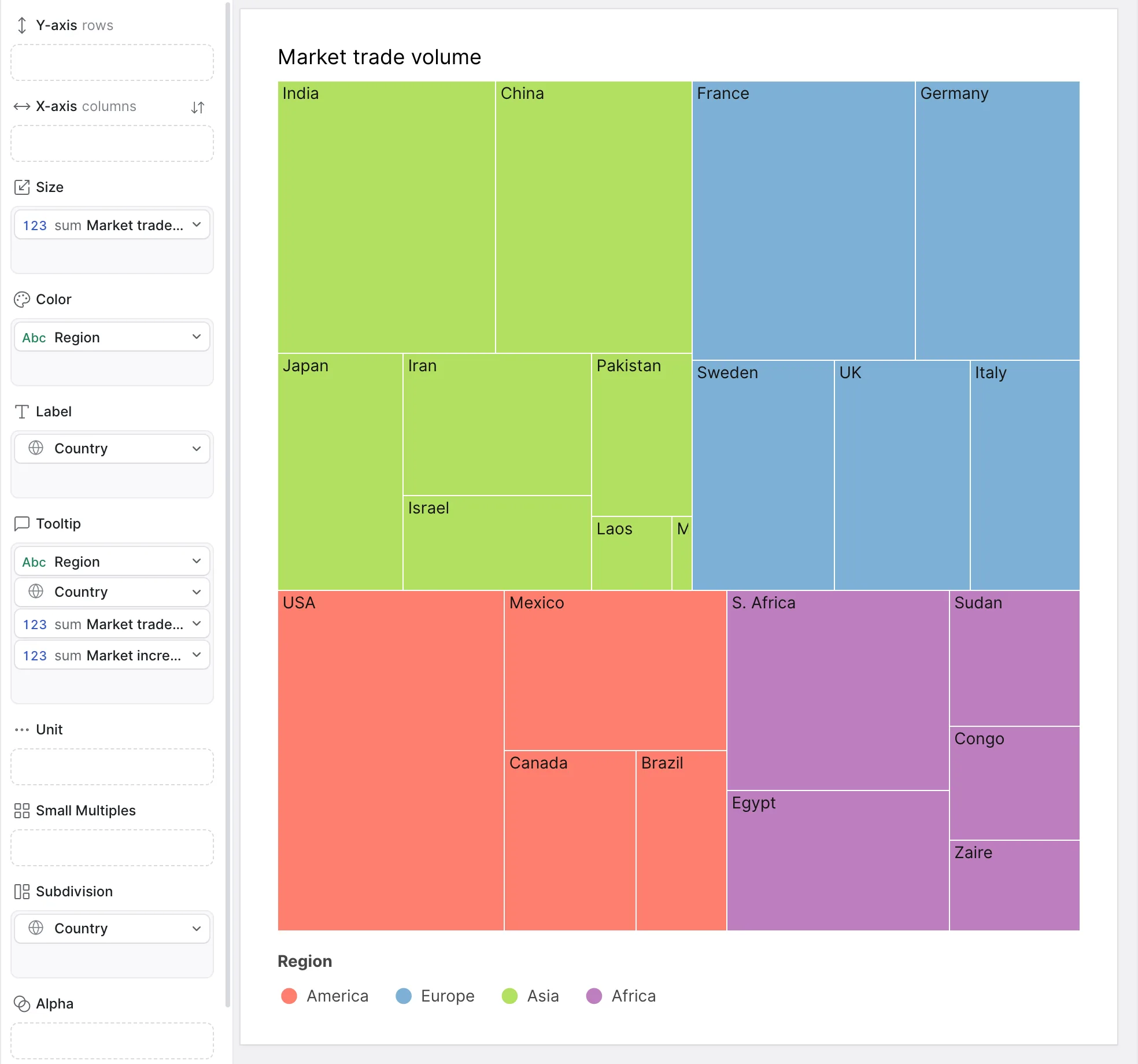
This is the channel behind a whole family of charts. A bar chart with a variable on Subdivision is a stacked bar chart. A circle mark subdivided is a pie. A rectangle subdivided is a treemap. You are not choosing those charts — you are subdividing a mark, and they are what subdivision looks like on each mark type.
It accepts categorical variables, and unlike Unit it takes several.
To nest one level inside another — regions inside continents, subcategories inside categories — put the parent on Color and the child on Subdivision.
Putting two variables on Subdivision does not nest them. Both are used to split the mark, at the same level. It is the single most common wrong first guess with treemaps.
Small Multiples: repeating the chart
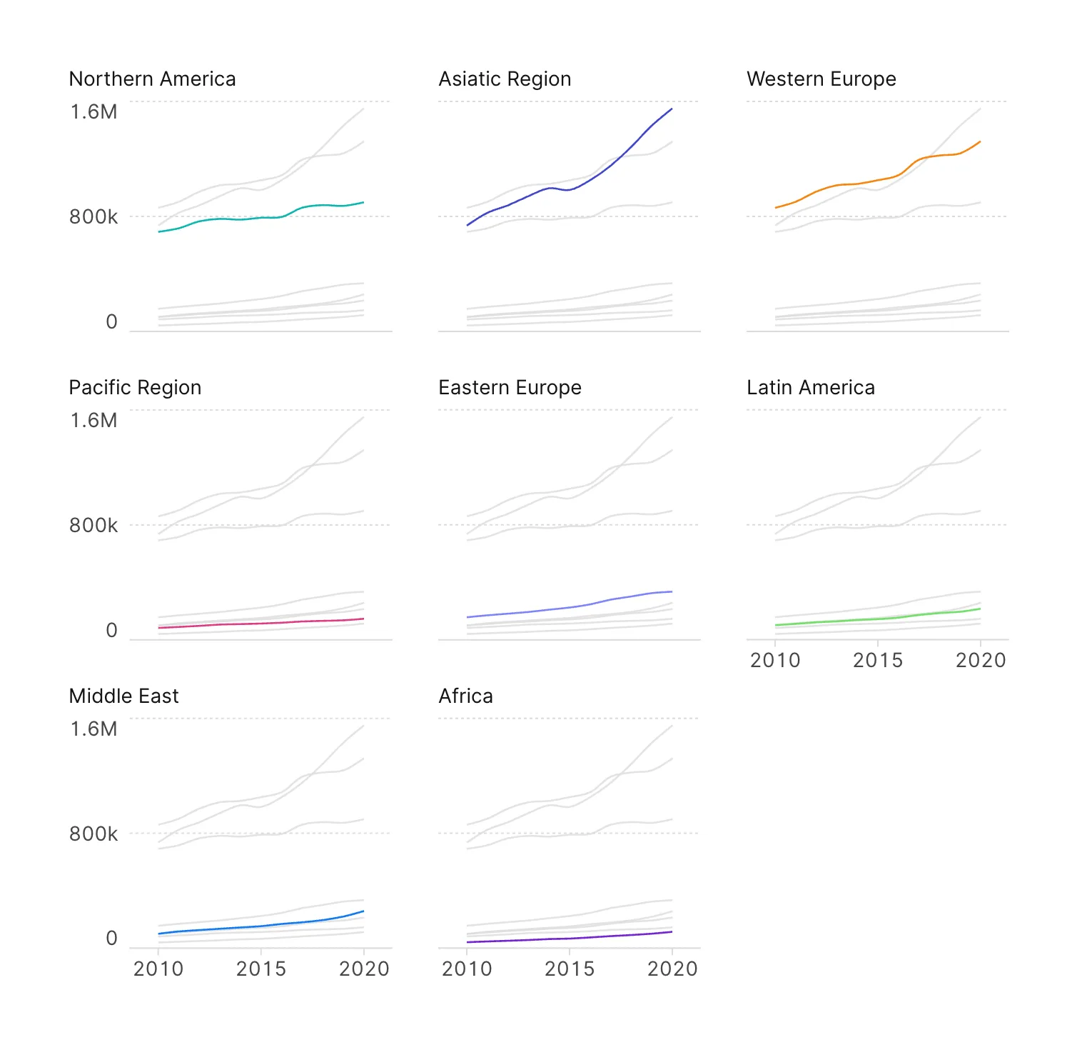
Small Multiples takes the chart you have built and repeats it once for every value of a categorical variable, laying the copies out in a grid. Each copy holds only its own subset of the data.
It is the answer to a chart with too much in it. Four series crossing each other on one pair of axes are hard to read; the same four as four small charts, side by side, are trivial — because comparing shapes across panels is easier than untangling overlapping lines.
It takes one categorical variable, and a handful of settings control how the grid is drawn:
| Setting | What it does |
|---|---|
| Aspect ratio | Width-to-height of each panel, as a ratio: type 16:9, 3:2 or a number such as 1.78, pick one of the common ratios from its menu, drag its shape, or swap width and height with its button. 1:1 is square. Rows and columns are recomputed to use the space well. Each panel keeps at least 60 pixels for its data: when the grid does not fit at that size, the whole chart grows in proportion and the canvas scrolls. |
| Padding | Space around each panel — top, bottom, left and right, in pixels. |
| Title | Whether each panel is titled, and the font, size, color and alignment of that title. |
| Background marks | Draws the whole dataset, in a flat color behind every panel, as context for the subset that panel holds. Available for point, line and radar charts. |
Every panel is measured against the whole dataset, not against its own subset, so the axes are identical across the grid and the panels are directly comparable. That is the point of small multiples, and it is not something you can turn off.
The consequence worth knowing: a category whose values are small next to the rest will draw a nearly flat panel. That is an honest picture of its magnitude, but if the shape of that series is what you want to read, use a chart per category rather than trying to rescale the grid.
Background marks is the setting that repays the most attention. With it on, each panel carries a faint copy of the entire dataset underneath its own subset, so you read every panel against the whole rather than against the memory of the previous one. It applies to point, line and radar charts, and its color and opacity are set alongside the checkbox.
Choosing between them
All three are ways of handling a categorical variable you cannot simply ignore, and the choice is mostly about how much attention it deserves:
| Use | When |
|---|---|
| Unit | The category is the subject of the chart, and the rows underneath it are just detail. |
| Subdivision | The parts matter, but so does the total they add up to. |
| Small Multiples | Each category deserves reading on its own, and comparing them is a second step. |
| Color | The category is context — worth distinguishing, not worth restructuring for. |
Where to go next
Two of these channels collapse rows into marks, which raises the question of what happens to the numbers when they do. That is An introduction to aggregation, and it is the natural companion to this chapter.