
Part I · Fundamentals · Chapter 14
Exporting your visualization
A chart is finished when it is somewhere else — in a paper, a slide, a report, a colleague's inbox. Graphica offers four ways out, and picking the right one is mostly a question of what happens to the chart next.
The export menu
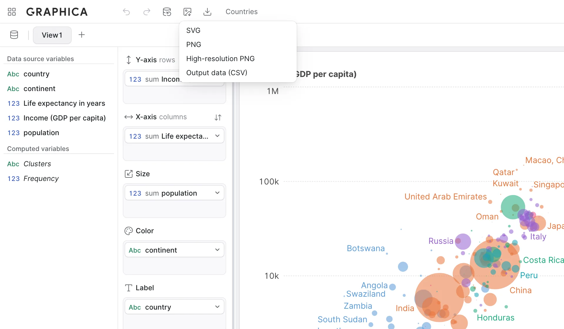
With a chart tab open, Export in the toolbar offers:
| Option | What you get | Reach for it when |
|---|---|---|
| SVG | Vector graphics. Scales to any size without degrading, and every element stays editable in a vector editor. | Print, publication, or anything that may need retouching later. The default choice. |
| PNG | A bitmap at screen resolution. | Quick sharing — chat, email, a draft document. |
| High-resolution PNG | The same image at a much higher pixel density. | Somewhere that needs a bitmap but will show it large: slides, posters, a journal that refuses SVG. |
| Output data (CSV) | The dataset the chart is actually drawing — after filtering and aggregation. | Checking your work, or publishing the numbers behind the figure. |
On the data tab, where there is no chart to export, the menu offers CSV format instead: your data as it currently stands, including any computed columns and type corrections. If a chart cannot be exported because none has been generated, the menu says so rather than producing an empty file.
Output data is not your data
The distinction between the two CSV exports is worth being precise about, because they answer different questions.
CSV format, from the data tab, is your input: the rows you loaded, plus the columns you computed. Output data (CSV), from a chart, is the chart's output: the rows that survived your filters, grouped by whatever the encoding groups by, with the quantitative variables aggregated exactly as the marks show them.
That second file is the most direct way to verify a chart. If a bar looks too tall, the output data has the number that bar is drawing and the group it came from. It is also what you publish alongside a figure when a reader should be able to reproduce it — the source dataset plus the encoding, rather than a screenshot.
A spreadsheet runs any cell that starts with =, +, - or @ as a formula, which a dataset from someone else can abuse. Both CSV exports therefore put an apostrophe before texts and column names that start that way, so they open as plain text. Numbers, including negative ones, are written as they are, and the data inside the project is not changed.
Sizing before you export
The export is made at the chart's own dimensions, not at whatever size the window happens to be. Two general settings decide them:
- Width and Height, under Page setup — set them explicitly and that is what you get, on screen and in the file. Left unset, the chart fills its container, and the export follows whatever it was at the time.
- Transparent, under Background — drops the background fill, so the chart sits on the colour of whatever you place it on. Worth turning on for slides with dark or tinted backgrounds; leave it off when the background is doing design work.
Setting explicit dimensions before exporting is a habit worth forming. It makes exports reproducible — the same chart exported twice is the same file, rather than depending on the size of your browser window that day — and it lets you match a target column width exactly instead of resizing afterwards.
An SVG references fonts by name rather than embedding them. Opened on a machine without the font you used, it falls back to something else and the layout shifts. If the file is going to someone else's computer and the typography matters, either stick to a widely available font or send a high-resolution PNG.
Exporting the project instead
Everything above produces a picture or a data file — an end product. When the other person needs to continue the work, send the project instead: Download project writes a .gph holding the data and every chart with all its settings, and they open it in Graphica exactly as you left it.
The rule of thumb: send an image to a reader, send a project to a collaborator. See Your workspace for what the file contains and why it is also your backup.
A checklist before you export
Most problems with an exported chart are decisions that were fine in the app and stop being fine outside it:
- Does it work without a cursor? Tooltips and hover highlighting are gone in PNG and SVG. Anything essential has to be a label, an axis or a footer — see Adding interaction.
- Are the axis and legend titles readable? They default to column names. gdp_pc_2023 is fine while you build and not fine in a publication.
- Do the aggregations say what you mean? Check the badge on every quantitative variable — An introduction to aggregation.
- Is the filtering stated? A chart of three regions out of forty should say so, usually in the footer.
- Is the source in the footer? Where the data came from and when it was retrieved. Nobody has ever regretted adding this.
- Have you set the size? So the file matches its destination and the export is repeatable.
That is Part I
You can load data, correct its types, build a chart by encoding variables onto visual properties, control how rows are grouped and combined, restrict what is drawn, label it, make it interactive and get it out of the app. That is the whole working cycle, and most charts never need more than this.
Part II takes six specialized jobs and covers each end to end — maps, networks, clustering, trend lines, distributions and part-to-whole charts. They can be read in any order, and each assumes only what you have read so far.