
Part II · Advanced topics · Chapter 1
Displaying geospatial data
Graphica draws maps from the same grammar as everything else. There is no map mode: you tell it to draw geographically, and it takes the positions either from named places or from coordinates. Everything you already know about encoding still applies.
Getting a map at all
One thing is always required: the chart has to be drawing geographically. That means either the mark is the geographic one, which fills each region's outline, or the general setting Layout is set to Map (or Map + Avoid overlap), which places ordinary marks at real positions.
With that set, there are two ways to supply the positions, and they are genuinely different routes:
By named places
A column typed as Country or State / Province — not String. The type is what gives Graphica permission to look up geometry; see Data types, which also explains the red flags on values it cannot recognize.
You do not have to put that column on Unit yourself. As long as nothing is on Unit and both axes are empty, Graphica takes the first geographic column in the dataset and uses it as the unit for you. The slot stays visually empty; the map is drawn anyway.
Assign it explicitly when you need to override that choice — a dataset with both a country column and a province column, or one with two country columns where the first is not the one you mean. Whatever sits on Unit wins, and the automatic pick only runs when the channel is free.
By coordinates
Latitude and longitude do the same job without any geographic typing. Put the two numeric columns on the axes — longitude on X-axis | columns, latitude on Y-axis | rows — and set Layout to Map. The axes stop being axes: their values are fed through the map projection and each row is placed at its real point on the globe.
Nothing about the column names matters here — two plain numbers on the axes plus the map layout is the whole requirement, and the values are read as degrees. Names only matter to the chart wizard and the Chart Advisor, which look for lat and lon in a column name, and for values within ±90 and ±180, to offer you a map without being asked.
Named places give you region geometry: they are the only route to a choropleth or a cartogram, because those need an outline to fill or deform. Coordinates give you exact points, which named places cannot — a country column places every row at its country's centroid. Use coordinates for observations that happened somewhere specific: stations, sightings, incidents, addresses.
Which route you took, and how the marks are drawn, produces the two families of map.
The two families
| Family | How it is built | Reads as |
|---|---|---|
| Choropleth | Geographic mark shape, with a variable on Color. Named places only. | Region outlines filled by value. |
| Dot / bubble map | Layout Map, ordinary marks, usually with a variable on Size. Either route. | Symbols placed on the map, sized by value. |
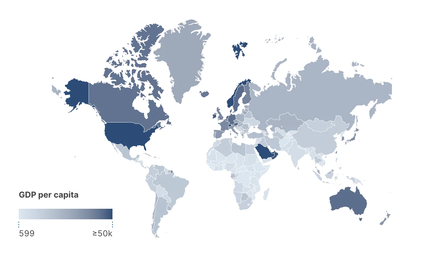
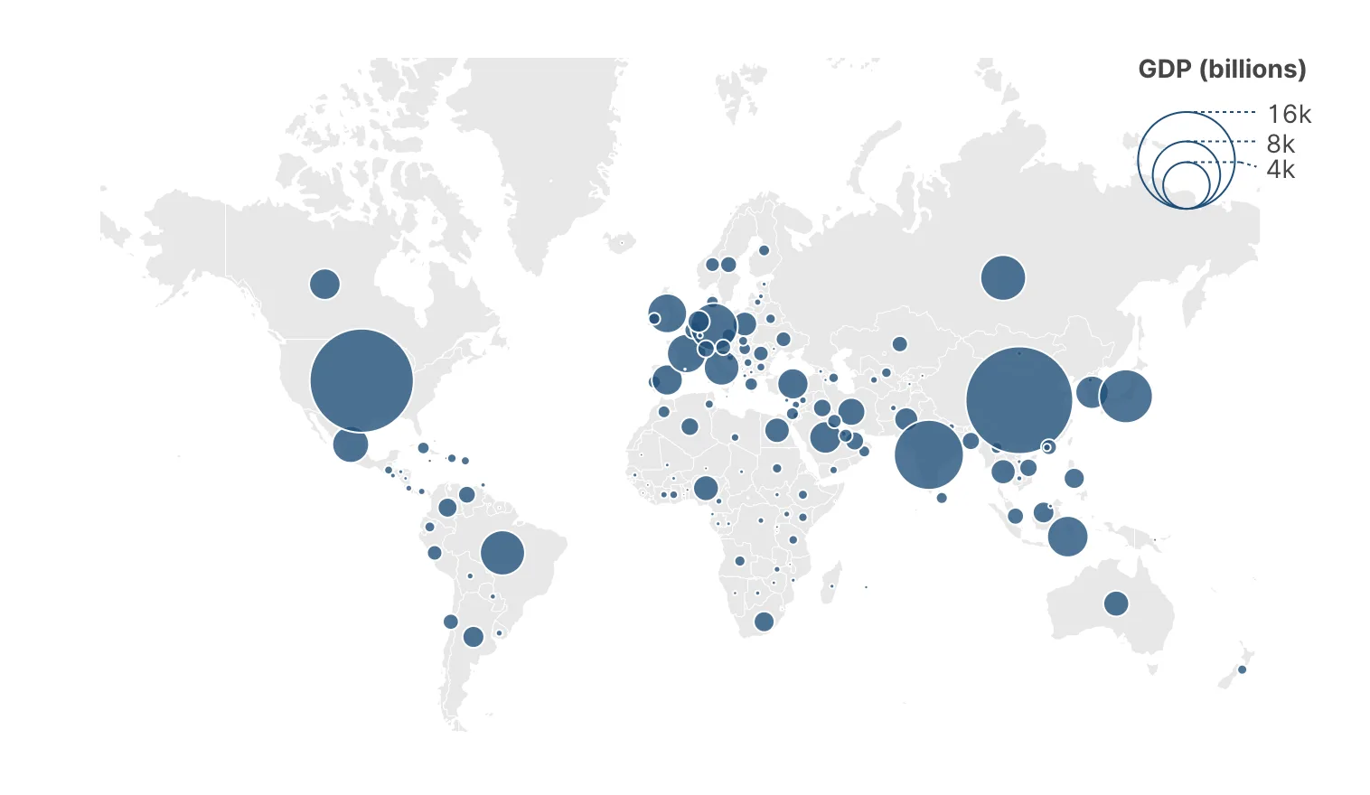
The choice is not cosmetic. A choropleth colors areas, so large sparse regions shout and small dense ones disappear — it suits rates, densities and shares, which are already normalized by area or population. A bubble map sizes symbols, so a small country with a large value is still large — it suits counts and totals.
Coloring a map by a raw total — population, sales, cases — produces a map of how big the regions are. Every large region is dark, every small one is pale, and the reader learns nothing they did not already know about geography.
Either normalize the variable first (per capita, per km², as a share) or switch to a bubble map, where size can carry the total honestly.
Choropleth — GDP per capita (a rate)
Bubble map — total GDP
Map settings
As soon as a chart is drawing a map, a Maps section appears in the chart's chart settings, the column to the right of the canvas — not in the settings of any one variable. It applies to both routes:
| Setting | Options | Notes |
|---|---|---|
| Map division | Country, Provinces/States | The granularity of the geometry drawn. |
| Map source | Natural Earth Data, Natural Earth Data (China POV) | Where the boundaries come from. The second reflects a different position on disputed borders. |
| Projection | Mercator, Natural Earth, Equirectangular | Mercator is the default and the familiar one; Natural Earth distorts area far less. |
| Auto-zoom | On, off | When the chart can be zoomed, frames the regions that have data rather than the whole world. |
| Regions | — | Colour and opacity of regions with no data. |
| Borders | — | Width and colour of the lines between regions. |
Two more settings decide how much of the world is drawn, and which pair you get depends on the route you took. On a map built from named places, shapes and borders can each be limited to regions that have data, taking you from a world map with your data on it to a map of just your data. On a map built from coordinates there are no regions with data to speak of, so instead you name a single country whose shape and borders stay visible, and the rest of the world drops away.
Mercator inflates area with latitude: Greenland arrives roughly the size of Africa. On a choropleth, where the reader is comparing filled areas, that systematically overstates high-latitude regions. If your map is about quantity rather than navigation, Natural Earth is usually the more honest default.
Provinces, and which country they are in
Province and state names are not unique across the world — there is more than one Córdoba, more than one Santiago. When a State / Province column is on Unit, Graphica needs to know which country to look them up in, and its settings gain a Disambiguation section for exactly that. This is one place where the variable has to be assigned by hand: the settings belong to the variable in the channel, so there is nothing to open until you put it there.
- By value — you name one country, and every province in the dataset is looked up inside it. Use this for single-country data, which is most province-level data.
- By variable — a column holds the country for each row. Use this when the file spans several countries.
Cartograms
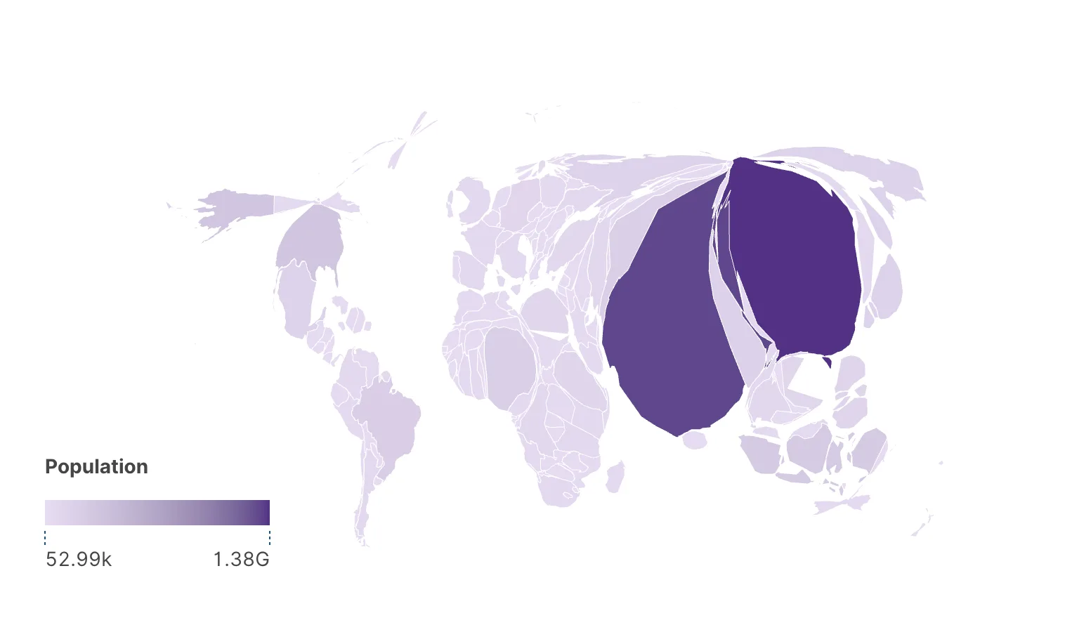
Putting a variable on Size while the mark is geographic gives a cartogram: the regions themselves are resized by value. It needs region geometry, so it is a named-places treatment only. Two algorithms are available.
| Type | What it does |
|---|---|
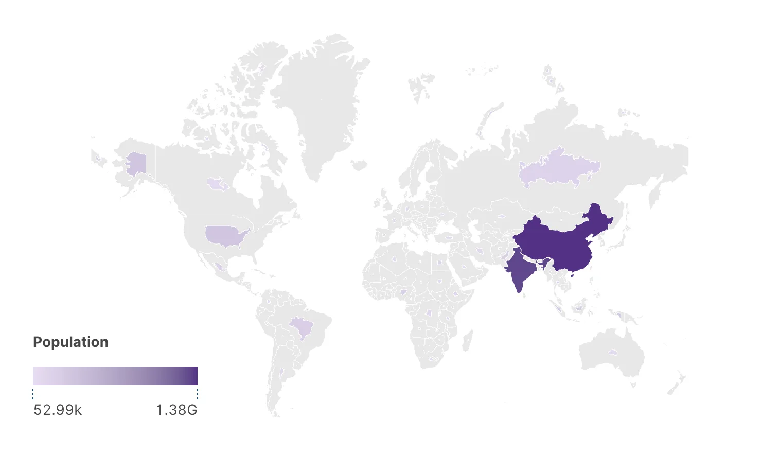
| Non-contiguous | Each region keeps its shape and is scaled around its own centre, drawn over its full-size silhouette so the eye can compare the two. Fast, and the shapes stay recognizable. The default. |
| Contiguous (Dougenik) | The borders themselves are deformed so regions stay connected. The map remains a single continuous surface; shapes distort. Considerably heavier to compute. |
The non-contiguous cartogram also has a Cartogram scaling choice, and it is a genuine trade-off rather than a detail:
- Relative to own area, the default, compares each region with itself: the region with the highest value keeps its full size, and one with half that value fills half of its own silhouette. Nothing grows and nothing overlaps. It is the right reading for rates and percentages, which do not add up across regions — but a large country and a small one with the same value look equally full, so it says nothing about totals.
- Proportional (Olson) makes displayed area proportional to value everywhere, the classic treatment: the densest region keeps its size and every other one shrinks to match. One outlier can leave the rest of the map very small.
Choose by what the map is for: Relative to own area for rates and shares, Proportional (Olson) for totals, when a reader may compare two regions' areas and expect the ratio to be true.
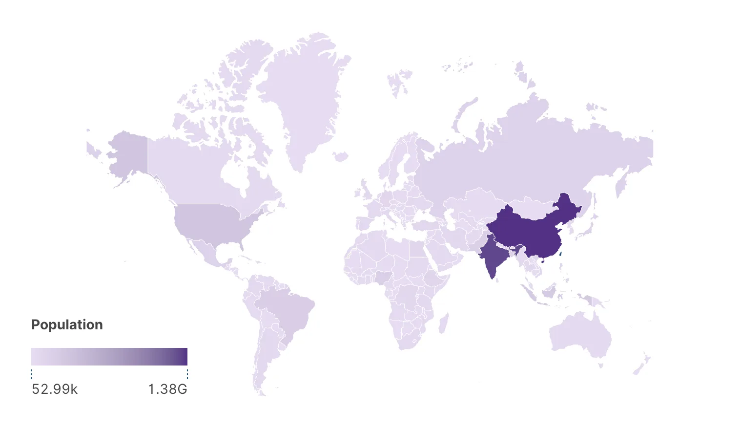
Choropleth
Non-contiguous cartogram
Contiguous cartogram (Dougenik)
Practical notes
- Overlapping symbols. On a dot or bubble map, set the layout to Map + Avoid overlap and marks are nudged apart while staying near their real positions. Positions become approximate — fine for reading, not for measuring.
- Splitting the world. Vertical order controls the vertical arrangement when the map is drawn in split panels, putting the Americas above or below.
- Small multiples work on maps. One map per year, one per category, on a shared scale. It is often a better answer than animation, and it survives export.
- Unrecognized regions are silent. On the named-places route, a value the map source does not carry simply has nothing to draw. Check the unknown count in the data tab before concluding a region has no data.
- Coordinates are not validated. On the coordinate route nothing checks that your numbers are degrees. Swap the two axes and the map still draws, with every point mirrored into the wrong hemisphere. If a dataset of European cities lands in the ocean, that is the first thing to check.
- The two routes aggregate differently. A country on Unit collapses its rows into one mark. Coordinates on the axes do not group anything, so with the point marks a coordinate map normally uses you get one mark per row. That is usually what you want, and it is aggregation behaving exactly as it does elsewhere.
Where to go next
Maps place marks by geography. Graph visualization places them by their connections instead.