
Part II · Advanced topics · Chapter 2
Graph visualization
A network is a dataset with a second table in it: the nodes, and the connections between them. Graphica reads the common network formats directly, and once the data is in, the nodes are encoded exactly like any other marks. What is new is the links — and most of this chapter is about them.
Loading a network
Five dedicated formats go straight in: .net (Pajek), .gml, .graphml, .gexf (Gephi) and .edges, which is a plain list of pairs — two columns for the endpoints, or three to carry a weight.
A delimited text file can also carry a network, and this is the route worth knowing because it is the one you can produce from a spreadsheet. Split the file into two blocks with a line reading *nodes and a line reading *edges, each block a complete CSV with its own header row:
*nodes
id;label;department
1;Ada;Research
2;Grace;Engineering
3;Alan;Research

*edges
id;id;weight
1;2;4
2;3;1
Three rules make it work, and all three are easy to get wrong:
- *nodes must be the very first thing in the file, in lower case. It is what tells Graphica to read the file as a network rather than as a table; anywhere else and it is just a value. *edges then follows further down.
- The two endpoint columns in the *edges block must carry the same name as each other — id;id above. Repeating the name is the signal; there is no source/target convention.
- That name must also be a column in the nodes block. It is the one Graphica matches the endpoints against, so it is the node identifier — and it does not have to be the first column.
Any further quantitative column in the *edges block is taken as the weight. If no matching pair of repeated names is found, the links are simply ignored and you get an ordinary table, which is the symptom to look for when a file that should be a network is not behaving like one.
With no chart open, Export on the data tab writes the data as CSV in exactly this layout — semicolon-separated, both blocks — so a network round-trips through a plain text file. It is also how a network is stored inside a .gph.
Whatever the format, you end up with the same thing: a nodes table and a links table, each on its own tab — with its row count — at the foot of the data tab. The nodes table behaves like any dataset — typed columns, computed variables, the lot. The links table holds the connections and any attributes they carry.
You can also build a network from an ordinary dataset, without a list of links at all: the connection variable setting draws links between marks that share a value. Useful when your data expresses relationships as a shared key rather than as explicit pairs.
Nodes are just marks
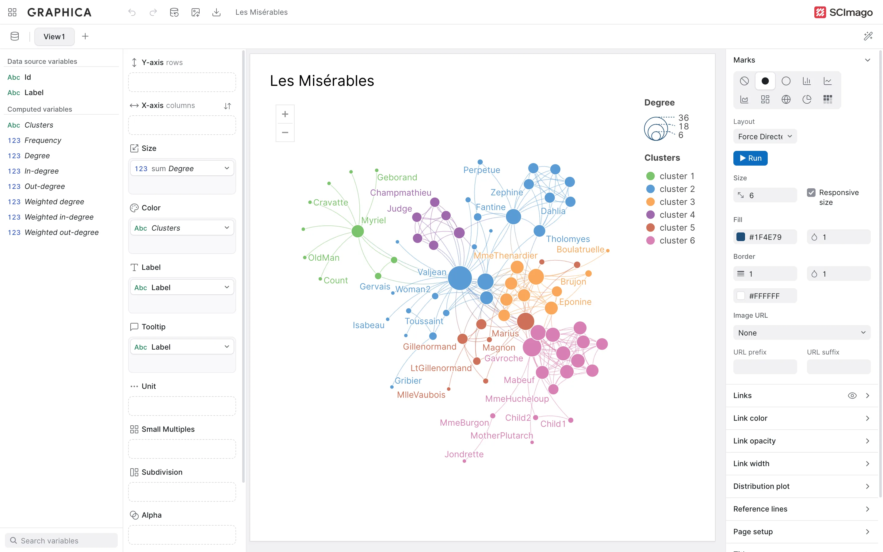
This is the part that surprises people coming from dedicated network tools. Nodes have no special channel: put a variable on Color and the nodes are colored, put one on Size and they are sized, put one on Label and they are named. Filters, aggregation, small multiples and tooltips all work as usual.
What decides where they go is the layout, under Marks in the chart settings. Any dataset has four options there; a dataset with links has thirteen, because nine graph-drawing algorithms are added to the list.
| Layout | What it does |
|---|---|
| Default | No layout pass at all. Marks sit where the encoding puts them: on the axes if variables are there, or in the ordinary arrangement Graphica uses when they are not. On a network the links are still drawn — between nodes that were never positioned with the links in mind. |
| Avoid overlap | Keeps the encoded positions but nudges marks apart so none sits on top of another. |
| Map | Nodes are placed geographically — a connection map. See Displaying geospatial data. |
| Map + Avoid overlap | Geographic placement, then separation. Positions become approximate. |
Of those four, only Avoid overlap and Map + Avoid overlap take Distance between marks and Spatial boundaries, which set the minimum spacing enforced and whether marks are kept inside the frame. The settings appear when you pick one of those two and are hidden otherwise.
The graph layouts
These appear only when the dataset has links. They differ in what they try to make true of the picture, which is the useful way to choose between them:
| Layout | What it optimizes | Reach for it when |
|---|---|---|
| Force Directed | A spring model: linked nodes attract, all nodes repel. Heavier links pull harder. | You want the ordinary network picture and have no more specific question. It is what the wizard picks for a network diagram, and the one to start from. |
| Force Directed + Distances | The same springs, but repulsion is scaled by how many hops apart two nodes are, computed over the whole graph first. | Distance on screen should mean distance in the network. Slower, and worth it when the reader will judge "how far apart" rather than only "what is connected to what". |
| Kamada & Kawai | Minimizes the mismatch between screen distance and shortest-path distance across every pair of nodes. | Small and medium graphs where you want the most faithful, most symmetric picture available. It is the most expensive option and does not scale to thousands of nodes. |
| LinLog | An energy model (Noack) that trades node separation for group cohesion, pulling densely connected sets into visibly distinct blobs. | The question is communities: which groups exist and who belongs to which. It separates clusters far more clearly than a plain force layout, at the cost of a less even use of the canvas. |
| Dagre Top-Bottom | Layers the nodes by rank and draws them as a hierarchy flowing downward, ordering each layer to reduce crossings. | The graph is directed and acyclic — a tree, a dependency graph, a process, an org chart. On a graph with cycles it still draws, but the hierarchy stops meaning anything. |
| Dagre Left-Right | The same, flowing sideways. | The same, when labels are long: horizontal flow gives node names room that vertical flow does not. |
| Horizontal linear | Runs a force layout constrained to one axis, then spaces the nodes evenly along a horizontal line in the order it produced. | You want an arc diagram. Neighbours in the network end up as neighbours on the line, so the arcs stay short and readable. Pair it with curved links. |
| Vertical linear | The same along a vertical line. | The same, when the chart is taller than it is wide, or when node labels read better stacked. |
| Circular | Places every node on a circle and curves the links through the middle, bundling them hierarchically. | A chord-style diagram of who connects to whom, especially when the nodes fall into groups. It is the one graph layout that is fully deterministic. |
On the Circular layout, the order of nodes around the circle is taken from the categorical variables you have encoded — Color first, then Shape, Subdivision, Small Multiples and Unit. Put a group variable on Color and the ring arranges itself by group, which is what makes the bundled links legible: within-group links stay near the rim, between-group links cut across.
Running, re-running and keeping positions
The algorithmic layouts get a ► Run button below the dropdown. It is there because positions are computed once and then stored with the chart: reopening a project does not shuffle your network, and nodes you drag by hand stay where you put them. Press ► Run to throw that away and lay the graph out again from scratch.
That matters more than it sounds. The iterative layouts start from wherever the marks currently are and settle into a local arrangement, so running one twice does not reliably give the same picture — pressing ► Run again until the graph untangles is a legitimate technique, not a sign something is wrong. Circular is the only graph layout with no button: it computes the same ring every time, so there is nothing to re-run.
Every layout above only runs when the mark is a point or a bar — none, disks, circles or bars. Switch a laid-out network to areas, a filled map or a circle chart and the stored positions are discarded along with the layout, and the marks fall back to the ordinary encoding. Going back means running the layout again.
Finally, putting variables on the axes is itself a layout decision, and it overrides nothing gracefully: a network with time on the x-axis becomes a timeline, and a network with a category on the x-axis becomes an arc diagram positioned by that category rather than by the algorithm.
Links
Links have their own block of settings, separate from the marks.
Form
The row of icons at the top of the links settings chooses the geometry — Lines, Arrows and Fine arrows for directed graphs, Tapered links that indicate direction by thickness, Curved links (two icons, bending horizontally or vertically), Link bundling, and Great circle arcs on maps. The straight forms also take a Curvature; once it is above zero, Clockwise curvature picks which way the links bend. The main use of curvature is separating the two directions of a reciprocal pair so both are visible.
Colour and width
Both can be fixed or driven by data:
- Colour — a single value, a variable from the links table, or Use the same color as marks: a link between two nodes of the same colour takes that colour, and a link between nodes of different colours blends from one to the other, with its arrowhead in the colour of the node it points to. A further option, Use default color in links between marks of different color, draws those mixed links in the default colour instead, so within-group links are coloured and between-group links stay neutral. On a clustered network that one setting does most of the work of making structure visible.
- Width — fixed, or mapped from a link variable such as weight.
A quantitative link colour gets the same treatment as a mark colour: sequential or diverging scheme, optional stepping into discrete bands, and pinned endpoints. Both colour and width can carry their own legend, with their own title.
Opacity
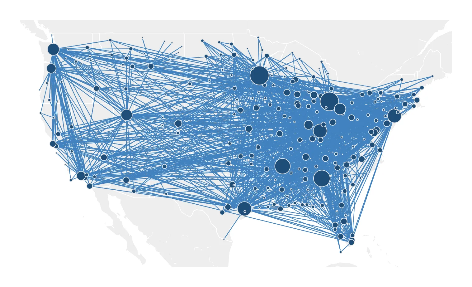
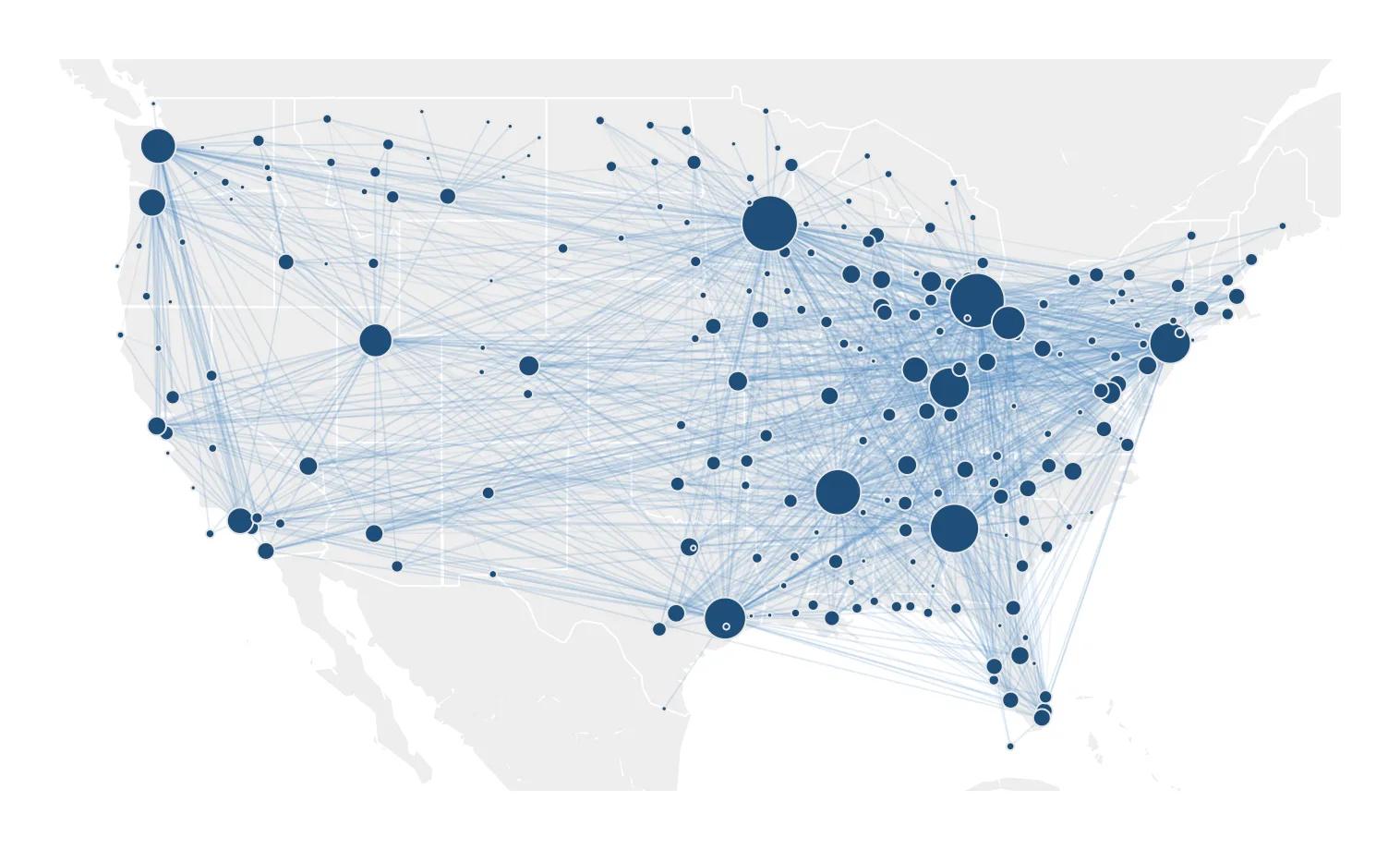
Link opacity deserves more attention than a single number field usually gets. On a dense graph, links at full strength form a grey mat that hides the nodes; the same links at low opacity accumulate where many run together, so the heavily travelled paths emerge on their own. Lowering it is almost always the first thing to try on a hairball.
Taming a dense graph
Beyond a few thousand links, a network stops being readable no matter how it is drawn. Three settings address that directly, and they work best in combination.
| Setting | What it does |
|---|---|
| Max. number of links displayed | A hard cap on how many links are drawn. Blunt, immediate, and useful for getting a first look at a graph that would otherwise take a long time to render. |
| Pruning | Removes less relevant links before rendering, by Link density or by Link weight. Density keeps the links that carry structural information; weight keeps the strongest. |
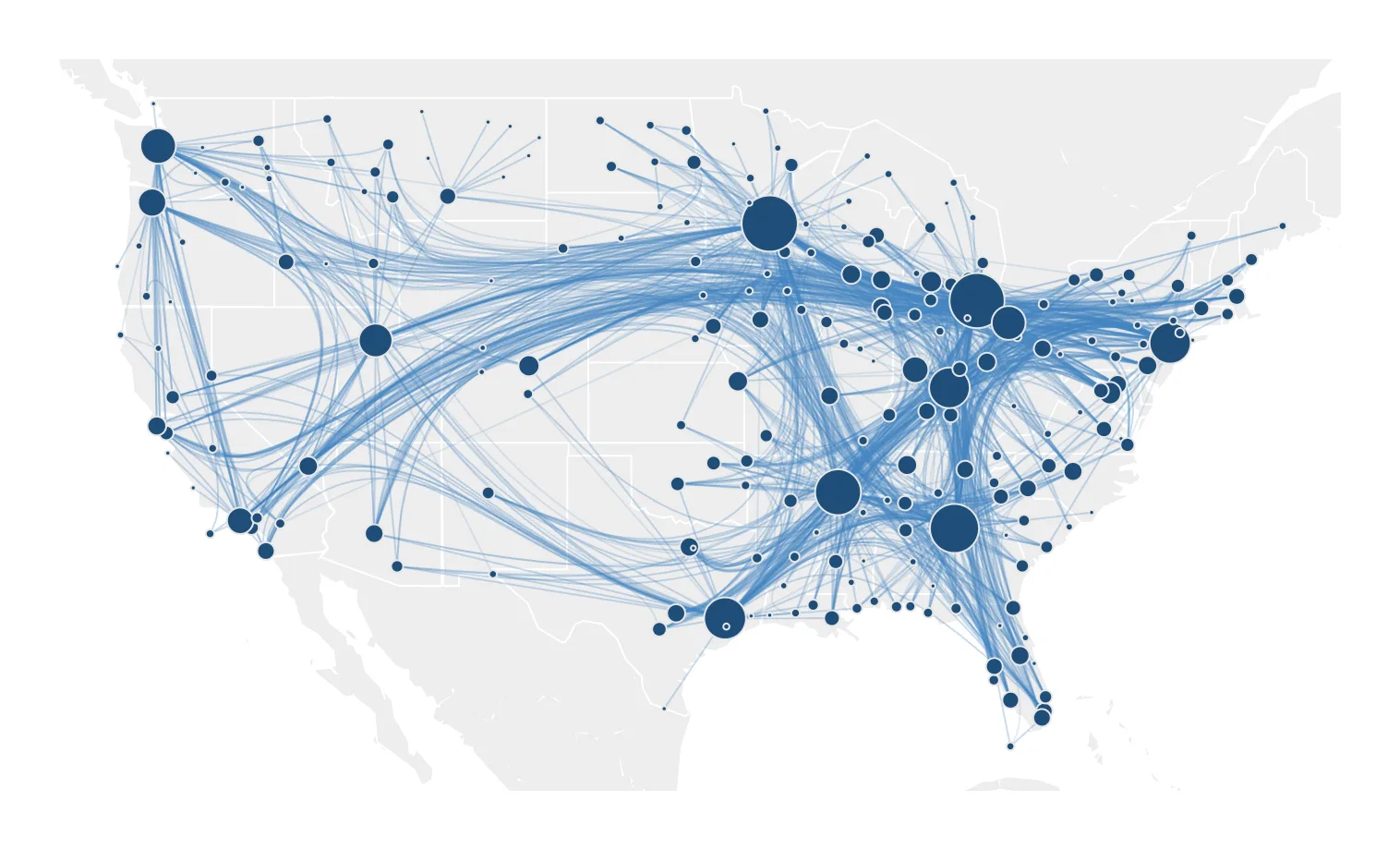
| Link bundling | Routes links that run in similar directions along shared paths, turning a mass of near-parallel lines into a few visible flows. Bundling tension sets how tightly they are bundled, from straight lines to full bundling; bundling can be computed on euclidean distance or weighted by a link variable. |
Capping, pruning and bundling all change what the reader sees, and only bundling is honest about it — a bundled graph still contains every link, while a capped or pruned one does not.
A pruned network that does not say it is pruned is a chart making a claim about connectivity that its own data does not support. Put the threshold in the footer.
Links at full opacity
Low link opacity
Link bundling
Network chart types
The wizard offers several, and they are all the same machinery with different layouts and encodings:
- Network Diagram — force-directed, nothing on the axes.
- Tree Graph — hierarchical layout, for graphs that are actually trees.
- Arc Diagram — nodes on a line, links arcing above it.
- Non-ribbon Chord Diagram — nodes on a circle, links crossing the interior. Bundling helps a great deal here.
- Time-based Network Diagram — a date on an axis, so connections are read against time.
- Connection Map — geographic layout, links as routes.
Where to go next
Once a network is on screen, the obvious question is which nodes belong together. Clustering answers it, and its default source is the links you just loaded.