
Part I · Fundamentals · Chapter 2
Data formats and arrangement
Before Graphica can draw anything it needs a dataset. This chapter covers the file formats it reads, the choices it asks you to make while reading them, and how to arrange your data so that encoding it later is straightforward.
Formats it reads
| Extension | What it is |
|---|---|
| .csv .txt .tsv .tab | Delimited text. The separator is detected automatically, and you can override it. Can also hold a network, split into *nodes and *edges blocks. |
| .xlsx | Excel workbook. |
| .edges | Plain list of links: two columns for the endpoints, or three to carry a weight. |
| .net | Pajek network. |
| .gml | Graph Modelling Language. |
| .graphml | GraphML. |
| .gexf | GEXF (Gephi). |
| .gph | A Graphica project — data and charts together. Opened as a project, not as data. |
The five network formats are read straight into a pair of tables — nodes and links — and are the subject of Graph visualization. A delimited text file becomes that same pair when it opens with a *nodes line and carries an *edges line further down, which is the easiest way to build a network from a spreadsheet; that chapter has the exact layout. Everything else lands in a single table.
Opening a delimited file
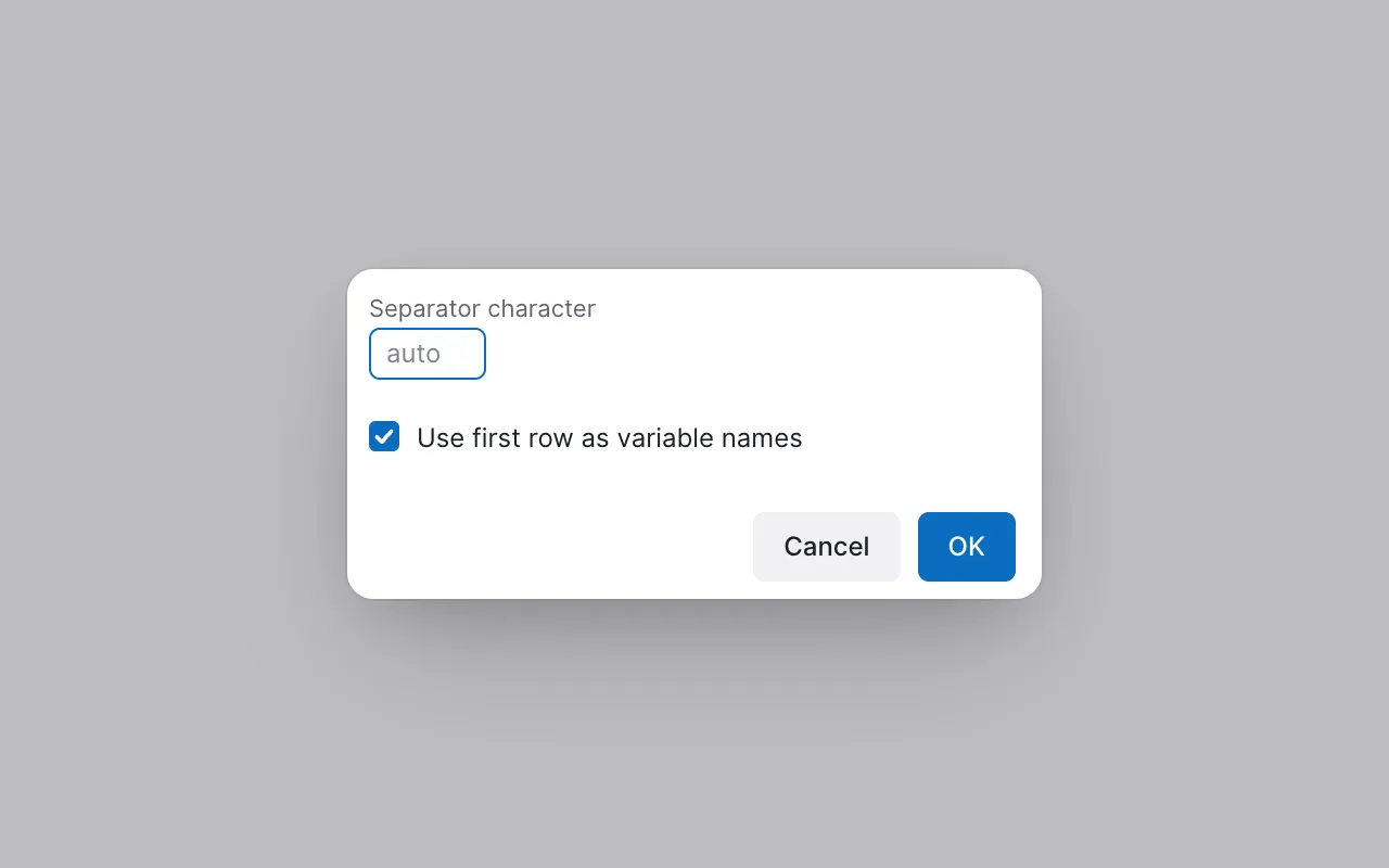
Text files are the only ones that need a decision from you, because there is no header in the file itself saying how it was written. Graphica asks two things:
- Separator character — left empty, the separator is detected automatically. Fill it in when detection gets it wrong, which happens most often with semicolon files that also contain commas inside quoted text.
- Use first row as variable names — on by default. Turn it off if your file starts straight into data, and the columns will be given generic names you can rename later.
Excel files ask a different question: a workbook can hold several sheets, so Graphica shows a Select sheet list and reads the one you choose. One sheet at a time — to combine sheets, combine them before importing.
How to arrange your dataset
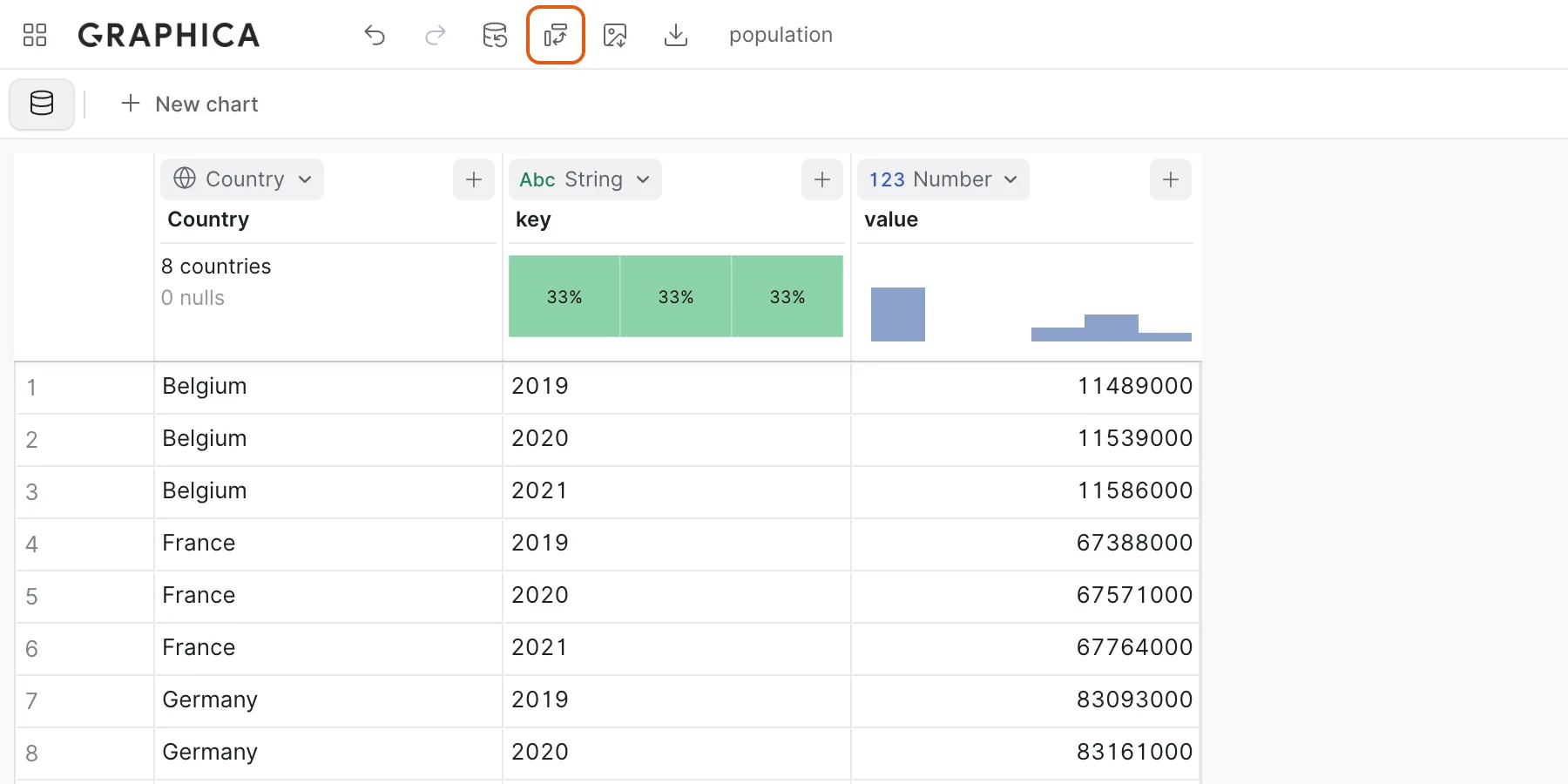
Graphica works best with data in long form: one row per observation, one column per variable, and every value of a given variable in the same column. If you have a column called Population and a column called Year, you are in good shape.
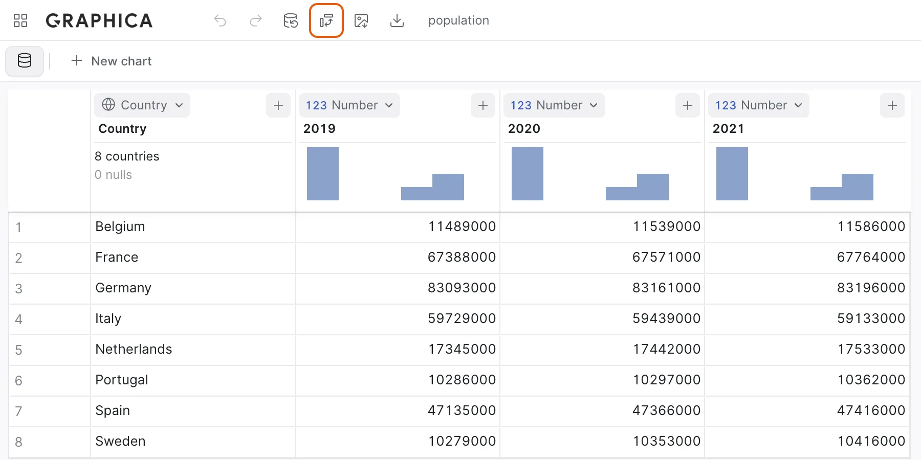
The arrangement that causes trouble is the wide one, where the same measurement is spread across many columns — 2019, 2020, 2021, each holding a population. That dataset has a variable, time, that Graphica cannot see, because it lives in the column headers rather than in a column. Encoding it means dragging three separate variables and hoping they line up.
| Wide — hard to encode | Long — what to aim for |
|---|---|
| Country, 2019, 2020, 2021 | Country, Year, Population |
| One row per country, three value columns | Three rows per country, one value column |
| Time is invisible to the grammar | Time is a variable you can put on an axis |
Pivoting without leaving the app
You do not have to fix this before importing. The Pivot data button in the toolbar reshapes the dataset in place. Columns to Rows asks which columns to fold and turns them into a single pair of key and value columns; Rows to Columns does the reverse, spreading a value column into one column per category of a key column. It is the fastest way to make a spreadsheet-shaped export usable, and it is reversible through Undo.
Before
After
A few practical points
- Missing values are fine. Empty cells are treated as missing rather than as zero. Line marks can either break at a gap or interpolate across it, which is a setting on the mark itself.
- Column names matter more than you would expect. Graphica uses them as a hint when guessing types: a column called Year is read as a date where a column called Value holding the same numbers is not. Data types explains exactly how far that goes.
- You can replace the data later. The Replace data file button in the toolbar reads a new file into the project you already have, without discarding the charts you built. They keep working as long as the columns they use are still present and still named the same — which is how you point a finished chart at next month's export.
Where to go next
With a dataset loaded, the next thing that matters is whether Graphica has understood what each column is — a number, a date, a country. That is Data types.