
Waffle chart
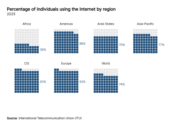
A waffle chart (or square pie chart) is a grid of equal cells, usually 10 × 10, in which each category fills a number of cells proportional to its value. Since every cell is worth the same, shares are counted rather than estimated from angles or areas.
How to
To create a waffle chart:
- Select 'waffle chart' under mark type.
- Link the quantitative variable to 'size' (without it, each category is counted by its number of rows).
- Link the categorical variable to 'color', 'subdivision' or 'shape'.
The 100 cells (10 when the space is small) take the shape that best fits the space of each waffle. Under "marks" you can change the fill order, the gap and the shape of the cells, even with an image of your own, as in a pictogram. With the 'proportional' scale every cell is worth the same amount in all the waffles: the grid fills the space with cells as big as a circle mark of that size, and the cells left over are drawn empty.