
Stacked area chart
A stacked area chart shows how several data series evolve over time by piling their areas on top of each other, so that the upper edge of the stack traces the total.
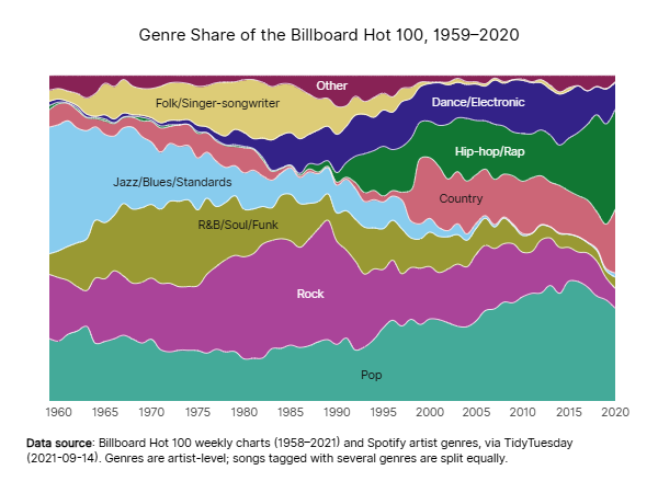
When the values are shares of the total (a 100% stacked area chart), the stack always fills the whole height and the chart shows how the composition of the whole changes over time.
How to
To create a stacked area chart:
- Select 'areas' in 'Marks'.
- Link a date or categorical variable to the ‘X-axis’ and a quantitative variable to the ‘Y-axis’.
- Link a categorical variable to 'color': each category becomes a layer of the stack.
The order of the layers is the order of the categories in 'color': sorting them by the quantitative variable puts the largest series at the bottom.
For a 100% stacked area chart, express the values as percentages of the total, set the maximum of the Y-axis to 100 and add '%' as the suffix of its labels.